Thank YOU! It's Customer Appreciation Week!
EXTRA 11% OFF Orders $100+ With Code: THANKYOU
EXTRA 11% OFF Orders $100+ With Code: THANKYOU

 Give a Cheer
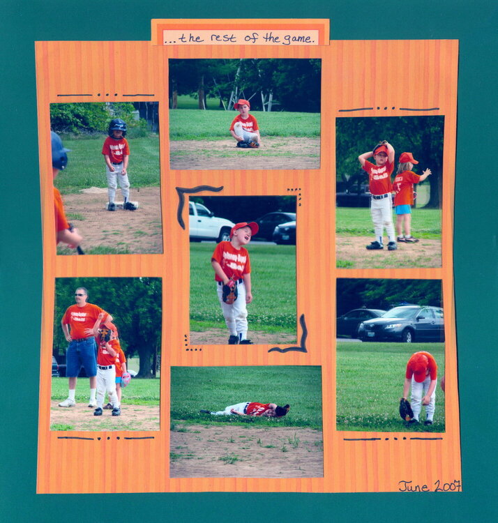
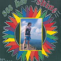
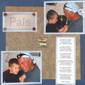
I am extremely disappointed in the scan but I could not get it to do any better. The orange square is exacctly that irl, SQUARE, not bent like this shows.
I liked completing this LO because it has been a goal of mine to do more multi photo lo's and fewer one photo because i feel that the multi photos tell more of a story.
No products have been added to this project.
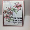
Thanks for spreading positivity!


October 19, 2007
October 16, 2007
September 23, 2007
September 18, 2007
September 18, 2007
September 18, 2007
September 17, 2007