This is SO cool...what an innovative interpretation of the challenge. I like the lettered paper behind the dolls. I agree with the thought that a light tan might work better than the white *but* I don't mind the white either.
This is such a creative idea. I never would have thought of something like this for the japanese challenge.. I LOVE LOVE LOVE the dolls and your little hand drawn kanji characters. Not to mention how adorable all your kids all.. I will agree with K about the background being white though I don't know about a bright color since the dolls contain so much color. I'm thinking like a light brown or tan that is reminiscent of an aged japanese scroll..
Wow Tiff, your LOs are getting better and better. I love the photo placement on this LO. Everything is so balanaced. Love the font/name blocks, the dolls, and strips of PP.
Photo placement =awesome. Dolls are cute and the season thang is awesome. I like the title and the middle having the character. This oh so rocks. I think the background cardstock being white should be a bright color like japanese art but everything else is perf dahling.
LOVE love love the dolls!!! I am terrified of paper piecing! I was thinking the same thing as Robyn about that lettered pp behind the dolls - but I like the way you set it up as well. Very nice.
WOW! I love your little dolls! They turned out FABULOUS! I think this was a most creative way to do this challenge. I love the placement of everything and I am having trouble finding anything that I would change about it. One oddball thought... the little blocks behind your dolls with the Japanese characters would have made an interesting BG for the entire page, or maybe just a few more of these placed behind the dolls would have made the dolls pop out more. Don't know what they are or how you would have made them into an entire BG...
Be U Te ful! Wow, I know i'm not the first to say it but it was my first reaction! LOVE the entire thing! Love the sectioning, the interpretation with seasons, the dolls are freaking adorable. GREAT job!
Wow! What a great first impression this page makes, Tiff! I absolutely love the paper, adore the dolls, dig the Japanese characters, and I think the bamboo looking font is a nice touch. You have good photo placement as well, not to mention tons of visual appeal. I also think your response to the challenge came from a unique perspective using the seasons like that. One suggestion I have is black photo corners on the white cs. Awesome job, sensei.
WOW double WOW...how do you think that fast, much less create it in 24 hrs. That is an awesome LO and with so much information on it and not cluttered.
OMG what an awesome response to this challenge! Love the little dolls & the origami paper. The seasonal concept/layout w/ the different dolls is great. Wonderful work!
Tiff this is an awesome LO, and a great job on the WC. I really don't see a thing i'd change. I love the dolls, they turned out great. Photo placement is great, paper is great. just a great LO!
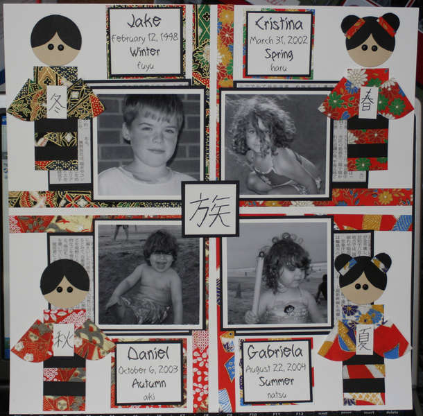
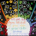
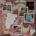
All four of my kids were born in the different seasons. Jake-winter, Cristina-spring, Gabriela-summer, Daniel-autumn. This paper is fine origami paper from my local Japanese market, Each paper doll is holding the kanji character for their season (hand-drawn, please forgive mistakes). In the middle, I have drawn the kanji character for family. Each block has their name, birthdate, season and the kun-reading of each season.
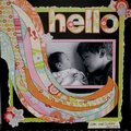
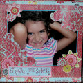
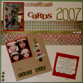
Does this project or one of it's images contain pornography, profanity, or other illegal or offensive material? If so, please report it and our moderators will come by and clean it up in a flash.
June 21, 2007
June 21, 2007
June 21, 2007
May 19, 2007
April 22, 2007
April 22, 2007
April 17, 2007
April 17, 2007
April 17, 2007
April 16, 2007
April 16, 2007
April 16, 2007
April 16, 2007
April 16, 2007
April 16, 2007
April 16, 2007
April 16, 2007
April 16, 2007
April 16, 2007
April 16, 2007