SHCG: when I clicked on the thunbnail and it enlarged I thought WOW this is beautiful. Perfect paper to compliment the photo. My only feedback is I wish the butterfly was more lifelike, maybe with some blues. A butterfly upgrade as well as a flower upgrade would bring this page to a higher level. Gee I never thougth I would become a butterfly snob.
SHCG: I tend to reserve this color combo for Christmas shtuff, too, but you've proven that it can look great on a different subject. Love the notebook paper journaling and green embellies. I especially like how you emphasized eternal in a different font. My only critique is to use a solid photo corner since you already have floral and striped pps behind it. Perfect placement and layering, and great job on the challenge.
SGCG - This is lovely! The beautiful pic, pp & cute butterfly flower embellie breathes a new summery light to this color combo. I like how repeated elements tie this all together (punched edges, pp, scallops) so nicely. Wonderful how "eternal" stands out in the journaling. Excellent work!
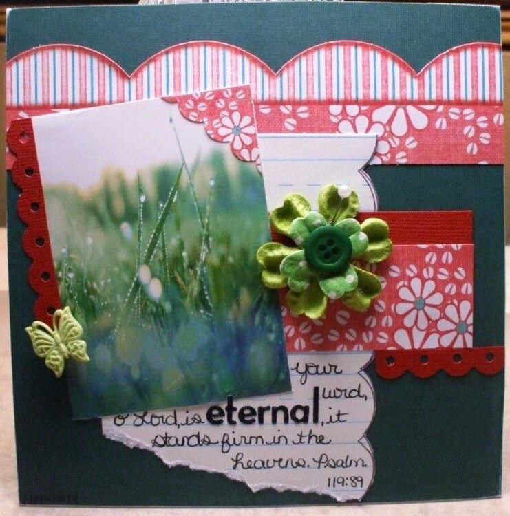
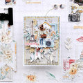
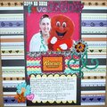
Our groups BWC was to make a layout using complimentary colors on the color wheel. I picked red/green when I saw that I had this cute Sassafras paper. I was afraid that those colors would be Christmasy but it worked out well. TFL :)
Does this project or one of it's images contain pornography, profanity, or other illegal or offensive material? If so, please report it and our moderators will come by and clean it up in a flash.
August 18, 2009
August 07, 2009
August 01, 2009
July 29, 2009
July 29, 2009
July 29, 2009
July 22, 2009
July 16, 2009
July 14, 2009
July 14, 2009
July 14, 2009
July 14, 2009