FREE Standard Shipping on Orders $69+ with code:
FREESHIPPING

Cheers
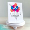
Give a Cheer

 Give a Cheer
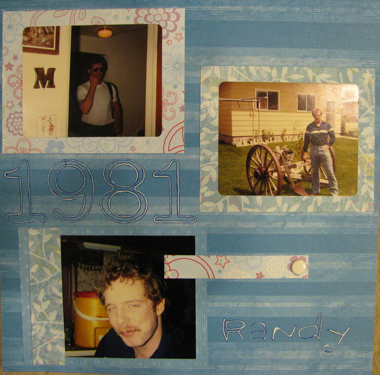
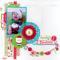
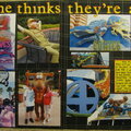
A few photos of my brother from 1981. I jumped out of my comfort zone to try and use multiple patterns in this LO. I had to laugh at the fact that I feel I accented the one picture on this page that my brother is going to hate (the I just woke up picture).
Let me know what you think.
No products have been added to this project.
Thanks for spreading positivity!


September 22, 2009
August 30, 2009
August 28, 2009
August 28, 2009
August 24, 2009
August 24, 2009
August 23, 2009
August 22, 2009
August 21, 2009
August 21, 2009
August 21, 2009
August 21, 2009
August 20, 2009