FREE Standard Shipping on Orders $69+ with code:
FREESHIPPING

Cheers
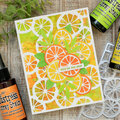
Give a Cheer

 Give a Cheer
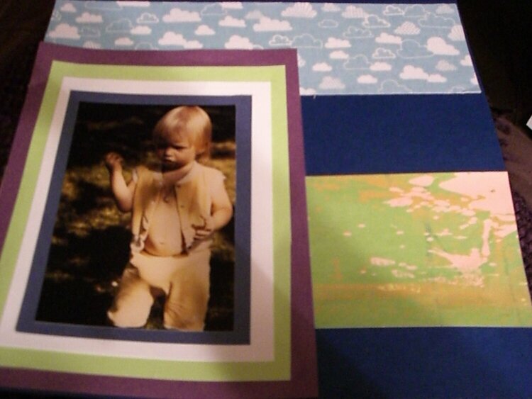
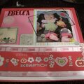
i need help on this, its not done but half way i stoped cause i did not feel right, please help me get it better
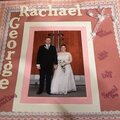
No products have been added to this project.


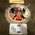
Thanks for spreading positivity!


November 13, 2007
November 12, 2007
November 12, 2007
November 11, 2007
November 11, 2007
November 10, 2007
November 10, 2007
November 10, 2007
November 10, 2007
November 10, 2007
November 10, 2007