Well, I thing you're an amazing scrapper!!! Love it. I don't think the blue stamps are bad, I really like it, think it goes well with the pp on the background (which I really love), the ribbon, the title, the design. I like everything and would suggest no changes. WOW! Those flowers are amazing also. Sorry, I can't help because I love it. And I'm a very lover of handwriting journaling so I love it also.
Again, I LOVE the title. It looks great! Beautiful blooms! I really like the way you tinted the pic. I love the idea of journaling like you're talking to her. This is precious.
Such a pretty lo! Love all the dainty pps you used. I have to agree with Dawn on lightening up the blue; either by using off-white cardstock or maybe distressing the blue you already have with a file or a tanish ink? I also like the idea of journaling as if you're talking to your daughter> Maybe something like, "LIbby, do you remember when we took this pic, or "Libby, do you renmember how much you loved your old-fahioned dress?" I do love the last line in yor current journaling though, and wouyld love to see that in your revised version as well. Love all the great embellies you used too; just beautiful :)
Cindy, this is a gorgeous LO!!! The design and all the elements are totally right on and hip -- a very cool take on a sepia-toned photo. Very inspirational and eye-catching. I agree, when you write to a person -- to your daughter, or even as if you're writing to old friends, it will help "loosen" up journaling (I learned this from SamsMom and circle journaling). I love the personal touch you gave to the journaling with your own handwriting -- whatever you do, don't change that. It's gorgeous and your daughter will cherish it!!!
Yes I agree with the journaling needs to be written like to your talking to your dd not abt her. And my next question is to you! Did you stamp that blue on white cs or paper? I personally think the blue is to bright for the rest of the blue in this LO. It kind of pulls away from everything else that goes really well together. YOu might try doing the blue stamping on beige or off white paper. Just to make it blend more. This is only my idea. I do love the design and placement of everything. That pic of your dd is phenomenal. Super design!! tfs!
I think the blue stamps do blend with the design, it does have some blue parts in the pp right? I love the photo of your dh! Perhaps you could be a little more informal in your journaling, tell Libby how you felt when you were taking her pic and how proud you were when she wore this dress for this pictorial. At least something like that! I love your choice of pp!
i know how you feel about re-doing a lo when everything is glued down like that! LOL since you aren't re-doing this page any time soon, i shall offer my 2 cents regarding the journaling... fo now. :) have you ever considered journaling as if you were talking to her instead of about her? that way, it gives a more personal touch to it thus not sounding "too stiff" (as you call it). ;)
as for the paper choice and lo... they're GREAT! ;) NEAT embellies too! :d the photo is just precious... she is so cute! :)
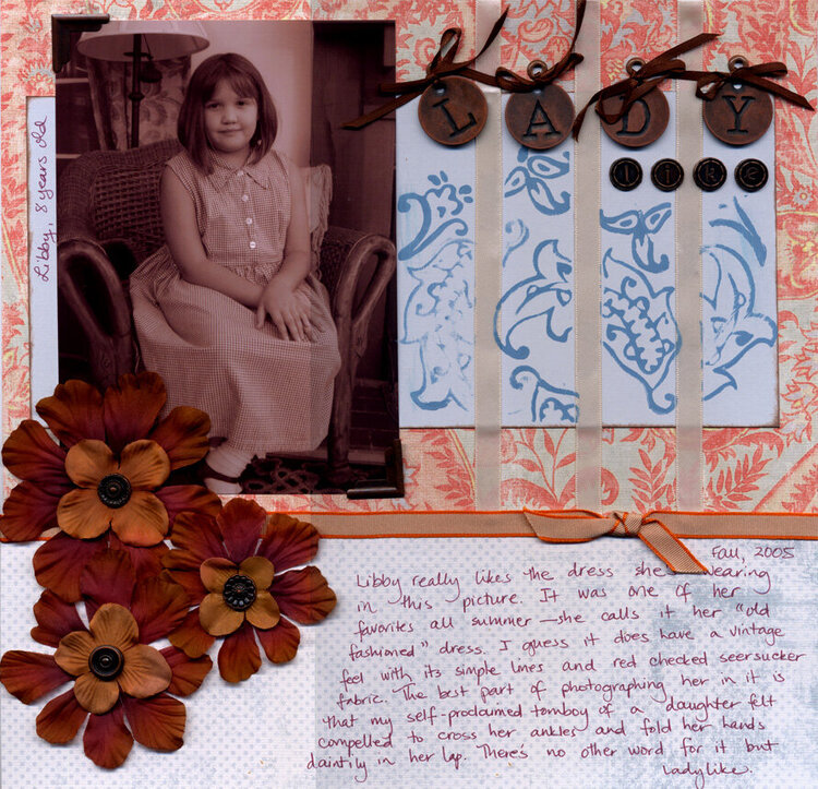
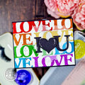
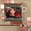
Critique group layout. This was done for a sketch challenge. I'm really regretting stamping the blue paper at top. The blue looked so plain that I'd hoped to add some interest. I wonder what I might have done instead (short of changing the paper since everything was already glued in place).
It's a bit hard to tell in this scan, but the small letters in the title read "like" (for Ladylike). I've added glue dots to the large letters in "lady" so they don't move around any more which they did when scanned.
The journalling is way too stiff so suggestions there would also be appreciated too. While I am not currently planning to re-do the page, it is still a possibility.
Thanks in advance for feedback.
[b]Products:[/b] Wild Asparagus "My Love" Paisley and Polka Dot/Blue The Card Connection Collage Keepsakes Copper Alpha tokens EK Success Architexture "Axaztmo I Nouveau Metal Alphabet" Making Memories Decorative Brads - Round Antique Copper Provo Craft Art Accentz Bigger Bradletz - copper photo corners Making Memories Paisley foam stamps Making Memories Scrapbook Colors - Cornflower Bazzill Basics Mono Ribbon - orange (satin ribbon) Grosgrain 2-tone orange and narrow brown satin ribbons - unknown Silk flowers - unk. Lg. Brown eyelets - unk.
[b]Journaling reads:[/b] [i]Fall, 2005 Libby really likes the dress she's wearing in this picture. It was one of her favorites all summer —she calls it her "old fashioned"dress. I guess it does have a vintage feel with its simples lines and red checked seersucker fabric. The best part of photographing her in it is that my self-proclaimed tomboy of a daughter felt compelled to cross her ankles and fold her hands daintily in her lap. There's no other word for it but ladylike.[/i]
Does this project or one of it's images contain pornography, profanity, or other illegal or offensive material? If so, please report it and our moderators will come by and clean it up in a flash.
February 13, 2006
December 21, 2005
December 11, 2005
December 09, 2005
December 09, 2005
December 09, 2005
December 09, 2005
December 09, 2005
December 09, 2005
December 09, 2005