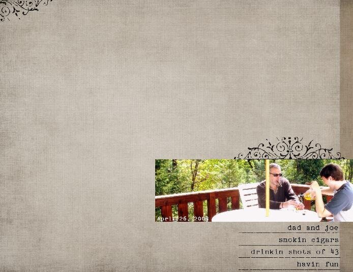
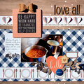
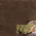
*CS* I like everything except the strip on the right. I'd have suggested the date but then I caught it! It's sort of neat that it doesn't pop out at first glance.
*CS* I too am not sure about the strip...I like it, but I think I might try sliding the photo and brushwork to the left so they don't appear to be diving off the edge of a cliff. Now, if you had PSE you could have gotten rid of the yellow umbrella pole!! LOL! I think it's great how dad and Joe get on...and great how you document it!
*CS* looks like Joe & your dad get along well-you should be thankful for that!!! I don't mind the strip on the right, although since your photo and journaling are there, I think it makes it a bit heavy on that side. Can you put another one on the left, or on the left edge of the photo?
*CS* I agree about the great design but I am not in love with the right side strip either. I might move the photo off the edge and then use that color strip as a thing mat instead. Love the swirl and the font though!!!
CS~I like teh overall design but don't care for the dark grey strip on ther giht. I would make the background all the same and the maybe add a brush border instead
Does this project or one of it's images contain pornography, profanity, or other illegal or offensive material? If so, please report it and our moderators will come by and clean it up in a flash.

 Give a Cheer


May 31, 2008
May 23, 2008
May 23, 2008
May 23, 2008
May 23, 2008
May 23, 2008
May 23, 2008
May 22, 2008
May 22, 2008
May 22, 2008
May 22, 2008
May 22, 2008