Thank YOU! It's Customer Appreciation Week!
EXTRA 11% OFF Orders $100+ With Code: THANKYOU
EXTRA 11% OFF Orders $100+ With Code: THANKYOU

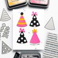
 Give a Cheer
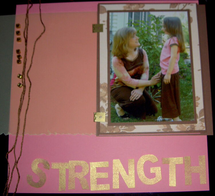
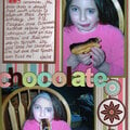
my daughter's monthly layout ... looking for critique/ideas before beginning to adhere items
No products have been added to this project.


Thanks for spreading positivity!


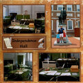


February 12, 2008
February 12, 2008
February 12, 2008
February 12, 2008
February 12, 2008
February 12, 2008
February 12, 2008