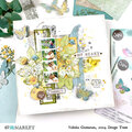
Storage & Organization up to 60% OFF!
Plus, a FREE Gift! | Details Here.
Plus, a FREE Gift! | Details Here.

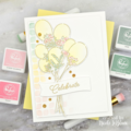
 Give a Cheer
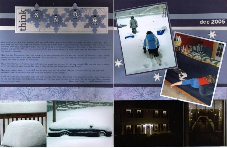
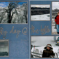
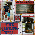
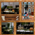
Looking for suggestions before I start adhering things. (Thank you!)
Particularly looking for suggestions to fill any spaces that are too empty and trying to avoid anything looks like I just threw things at the page.
Should I ink the edges of the mats on the main photos? Dark blue on the white? White on the dark blue? (did both although the white on blue looks light blue - need better white ink I guess)
Should I repeat the title on the second page? If so - towards the top? Or in the lower right corner (over the picturs)? If not at the top, should I put something on that big blue block? Move the snowflakes? The date in white letters? (I put the date in instead)
Are the snowflakes extraneous? Could they be better placed? Should I just get rid of them? (I moved them around a bit to make a better triangle. They are buttons, btw. I think the texture shows up better in the full sized scan.)
Other suggestions? (I did add slate blue ribbon to the dark blue cardstock.)
No products have been added to this project.
Thanks for spreading positivity!


March 08, 2006
March 06, 2006
March 05, 2006
March 05, 2006
March 05, 2006
March 04, 2006
March 04, 2006
March 04, 2006