FREE Standard Shipping on Orders $69+ with code:
FREESHIPPING

Cheers
Give a Cheer

 Give a Cheer
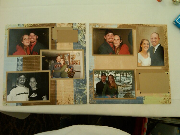
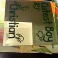
I did this page but haven't finished it...don't know what else it really needs except journaling
No products have been added to this project.


Thanks for spreading positivity!


January 18, 2010
January 01, 2010