
%20-%20Scrapbook.com)

FREE Standard Shipping on Orders $69+ with code:
FREESHIPPING


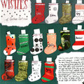
 Give a Cheer
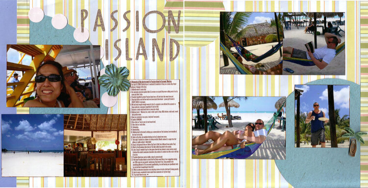
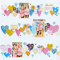
This is my response to my "Get To Know Your CG Blog" Challenge for Scrap Happenzz Critique Group. We have a lot of fun & useful links in our blog, so I challenged the group to scrap a LO incorporating inspiration from 5 of those links. This LO features images from our Passion Island excursion during a '09 cruise but the journaling is really about the whole day.
My 5 inspirations were:
1) Dirty Scraps blog (our fab member Marlene is on their DT!): Their May 25th Challenge #10 focused on "Serenity" so I was inspired to focus on a calm & peaceful memory.
2) Random Challenge Generator: I used this & got: "Use 2 or more photos and show a series of events or actions, use stripes in the background, use an embellishment that you have changed the colour of and use the colours orange and pink in the layout " I used green ink on a blue Prima flower to change its color. There are orange stripes in the background pp & pink stripes in the border strips/circle pp.
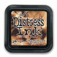
3) Tim Holtz: I inked w/ his Distress Ink.
4) Sketches by Suzy: I LOVE her sketches - so many multi-pic ideas right up my alley! - & used one here, #5.
5) "Layout Inspiration: 99 New Ideas to Try" (a scrapbook.com article!): I found & tried this idea: "Make a list of 25 of something and use it as the journaling on your layout."
The quilled palm tree is my own design (didn't follow anyone else's directions!); I haven't quilled in a while & thought it would be fun to revisit it.
As usual, the scan crops off the edges, there's more side margins on both side, the pp strip on the right has more of the background show to its right.
I did all but the quilling at a recent scrap retreat; I'm loving that Jubilee Cricut cart & added it to my wishlist!
The Anna Griffin pp was a gift from Eat Sleep Scrap - thanks Melissa!
TFL :)


Thanks for spreading positivity!


April 21, 2011
August 29, 2010
August 23, 2010
August 23, 2010
August 17, 2010
August 17, 2010
August 11, 2010
August 11, 2010
August 10, 2010
August 09, 2010
August 07, 2010
August 07, 2010