FREE Standard Shipping on Orders $69+ with code:
FREESHIPPING

Cheers
Give a Cheer

 Give a Cheer
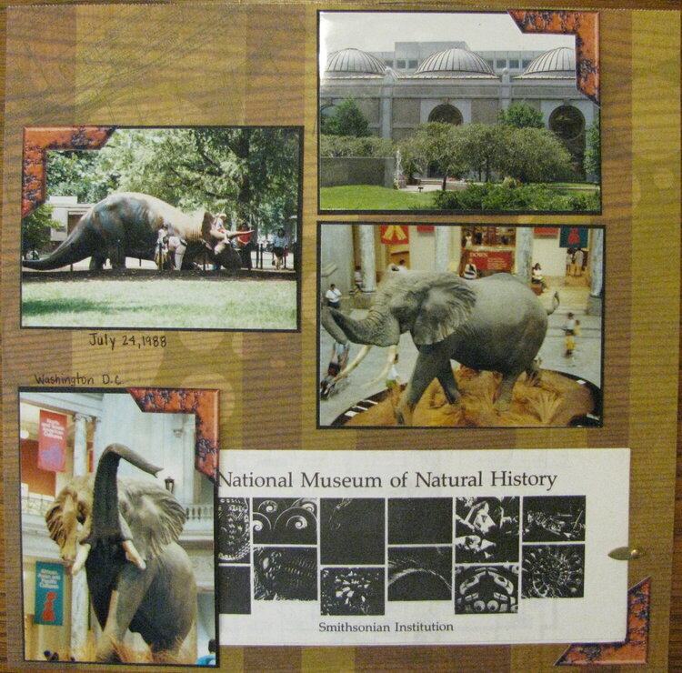
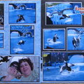
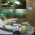
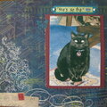
These are a few of the pics from this museum. So much to see and do here. I am really at a loss for how to embellish these LO's
No products have been added to this project.


Thanks for spreading positivity!


April 29, 2012
April 25, 2012
April 24, 2012
April 15, 2012
April 11, 2012
April 04, 2012
April 01, 2012
March 28, 2012
March 25, 2012