

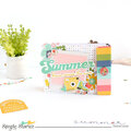
Thank YOU! It's Customer Appreciation Week!
EXTRA 11% OFF Orders $100+ With Code: THANKYOU
EXTRA 11% OFF Orders $100+ With Code: THANKYOU

 Give a Cheer
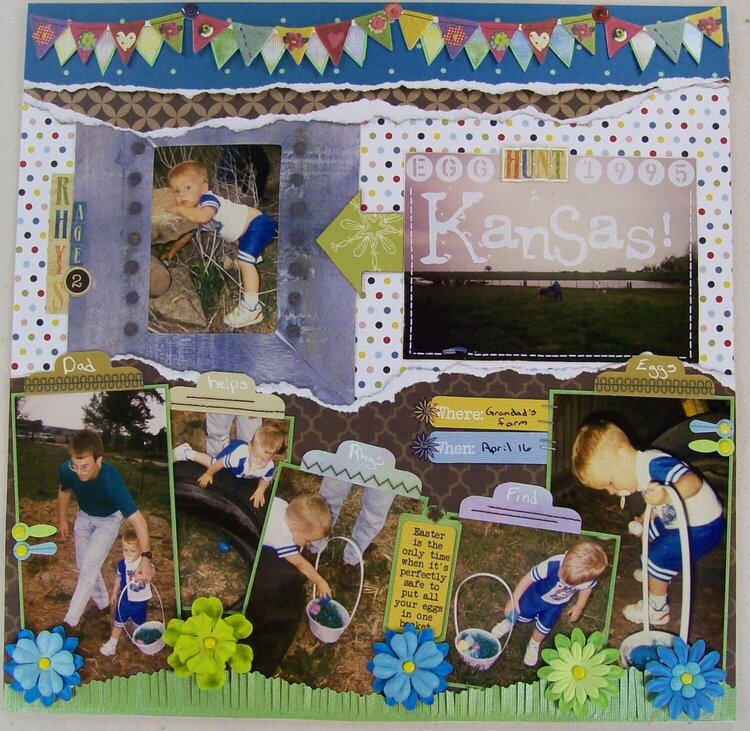
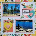
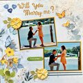
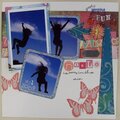
For some reason, on this lo I used a lot of old supplies...file labels, rub-ons, frame, themed stickers... It was fun using the old supplies, but I definitely wont' be able to link them for you!
I started the background with the polkadot pp, then messed up my plan for the double sided brown pp, so I ended up tearing it into a couple of strips and decided to have one side show at the top of the page and the other side at the bottom. The teal pp is a scrap and I tore the edge of it to work with the rest of me tearing.
For the bottom of the page, I used a scrap of green cs and cut one edge in a free-handed wave. Then I used the MS fringe scissors to create my 'grass'. I figured out which pics I wanted to use as my focal pics, then cropped the rest of the pics so that my son was the main subject. I matted the pics on green cs. and tucked them behind the grass. I layered flowers and added them with yellow mini brads. The photo turns were from a set of themed stickers and I added the yellow mini brads to them. The quote sticker and the "Where" and "When" stickers were from a set of themed stickers. I added a flower mini brad to the tag and added rubons and stoples to the other labels. I decided to add the file labels to the tops of the pics and do the journaling on them. I added the rubon on stitching...then went back and piereced holes where there would have been holes if it had been real stitching. I used a white pen to add the journaling.
I used an old frame to frame my main pic and tucked it behind the torn paper strips. I decided to use the landscape for my title, I used rub-ons and stickers to add the title, then added the rub-on stitching. I added the arrow between the two pics to tie them together. I used stickers to add my son's name and age. I used a premade banner at the top, but added the back row of triangles by cutting up stickers from on the the themed sticker sets to tie look of the banner together with the rest of the page a little bit. I used glossy accents on the 3 "buttons" that "hang" the banner.
I'm also entering this in the Boys Challenge

Thanks for spreading positivity!


November 06, 2012
October 30, 2012
October 29, 2012
October 29, 2012
October 28, 2012
October 27, 2012
October 27, 2012
October 26, 2012
October 26, 2012
October 25, 2012
October 25, 2012
October 24, 2012
October 24, 2012
October 18, 2012
October 17, 2012
October 14, 2012
October 11, 2012
October 08, 2012
October 07, 2012
October 07, 2012
October 07, 2012
October 07, 2012
October 07, 2012