

Livestream Party!
Join us today at 9:00am PT / 12:00pm ET | Details Here.
Join us today at 9:00am PT / 12:00pm ET | Details Here.


 Give a Cheer
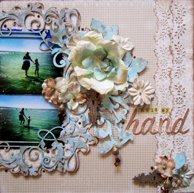
These pictures were taken this past summer by the lake as I was helping my daughter catch minows with a net.
This was the first layout I designed after my winter holidays. I had so many ideas in my head but I guess I was a little rusty after such a long break. It took me so many hours to design it and no matter what I did I wasn't happy with the final outcome. I got so frustrated with it that I took the whole layout appart and re-built it. I originally had it on a dark blue background and I couldn't figure out what wasn't working for me. I finally lifted the whole layout out and transfered it to the light beige background and then I relaxed.
I really think its important for designers to share their good and bad experiences. Showing how it can be so frustrating sometimes to find the right "look" for your project, the one that makes you happy. However when you finally do, it is so rewarding.
Now I really wanted to share what I did with the Blue Fern frame. As you can see, I cut it in half to frame my two photos at the edge of the paper. I roughly painted it in light blue acrylic and then stamped it with white script. Finally I lightly painted it with brown Shimmerz paint in different areas.
Kit
Maja Design: Let's Have Some Coffee: TVA FROKNAR
Maja Design: Let's Have Some Coffee: BLOMMOR PA BORDET
Blue Fern: Blue Fern Frame
Prima: Resist Canvas: Swirls
Glitz: Teeny Alphas: Tan
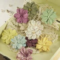
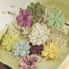
Flower Add-on:
Prima: Coventry: Serene
Prima: Botanical: Marri
Manor House Creations: Romance
Embellishment Add-on:
Leaky Shed: Keyholes
American Crafts: Thickers: Rainboots
Prima: Craftsman: Velvet Trinkets
From My Stash
Martha Stewart Punch
Glitz Script Stamp
Blue acrylic paint
Color box white ink
Pear pen-brown, ice-white
Shimmerz Pearlz- brown, ice blue


Thanks for spreading positivity!


September 29, 2013
September 29, 2013
September 29, 2013
September 29, 2013
July 05, 2013
April 08, 2013
April 08, 2013
January 29, 2013
January 27, 2013
January 27, 2013
January 26, 2013
January 26, 2013
January 26, 2013
January 26, 2013