Livestream Party!
Join us today at 9:00am PT / 12:00pm ET | Details Here.
Join us today at 9:00am PT / 12:00pm ET | Details Here.

 Give a Cheer
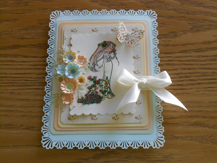
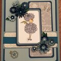
Sometimes the best made plans don't turn out quite as good as you wish. But it was a good learning experience. I tried to use a texture product for the roses. First, the color was just too dark for the color scheme, and the roses look like pompoms and not flowers. My thought was, red roses goes with anything. I was wrong, especially when they look like pompoms. I tried to contact the makers of the product and learned they have retired and closed shop. On painting the face, I didn't clean the brush well enough or the water was too diluted with brown color for the hair that the flesh tone was too dark. The special paper I purchased to use with my stamps images is pre-cut with scalloped edging. Turns out it does not hold up to water color painting. The paper becomes wavy. Finally the glue dollop I used for adhering the bow was too big, so you can see the big glue dot above and below the bow. Beyond that, here's the good stuff: The card features a punch around the page edging. I'm getting better at getting the design to fit the card size I need. There are 4 pastel frames for the image. Soft green, peach, yellow and floral print. The flowers are hand punched and layered with center gems. Little clear gems are scattered around. The butterfly is double punched. That is, two punches glued together at the center. The top butterfly wings are folded open to appear to be ready for flight. Clear gems create the body of the butterfly. An satin ivory ribbon wraps the frames together and tops the bundle with a bow. The stamped image is embossed and hand painted. Her dress bow is centered with a clear gem. I also chalked around the image with yellow shading. The paper doesn't really grasp the color, so is almost impossible to see. So....there were a few hurdles, but still respectable.
No products have been added to this project.


Thanks for spreading positivity!


January 30, 2013
January 29, 2013
January 28, 2013