Storage & Organization up to 60% OFF!
Plus, a FREE Gift! | Details Here.
Plus, a FREE Gift! | Details Here.


Be the first to cheer this project!

 Give a Cheer
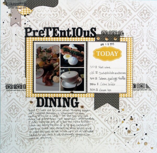
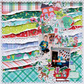
So I made this photo using a new app on my Android phone (PhotoFrame Free, if you're interested) and then printed it at a 4x4 size - it looks fab and retained the original photos' high quality.Since the subject was about this ultra fine dining experience, I felt the layout needed a very formal and sophisticated feel. I pulled my colours from the eggs, yellow beetroots and plates in the photo (yellow, white and black, grey). I don't usually enjoy yellow and grey together but I love this rich yellow so I'm quite happy with how it's come out.I used a diagonal design to counteract the weight of the banner and added some rounded elements to soften all of the hard, straight edges. Then I decided to spatter some black paint to emphasise the diagonal line a little more and added in some additional gold sequins and snipped tiny, tiny triangles from the pp to balance out the yellow across the page.
No products have been added to this project.
Thanks for spreading positivity!