Thank YOU! It's Customer Appreciation Week!
EXTRA 11% OFF Orders $100+ With Code: THANKYOU
EXTRA 11% OFF Orders $100+ With Code: THANKYOU
Be the first to cheer this project!

 Give a Cheer
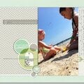
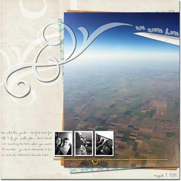
This week, I once again attempted to combine both lessons into a single layout.To address the proportion part of the class, I used a large photo to emphasize the “bigness” of the sky and the altitude is demonstrated by the patchwork landscape below. I wanted to include the smaller photos of the kids but I made them *really* small in comparison as well as turned them black+white to minimize their impact on the overall design.For the rhythm lesson, I used the flourish brushes (duplicated and resized/rotated) in different opacities to add some movement to the page and mimic the movement of the plane through the sky.
No products have been added to this project.
Thanks for spreading positivity!