FREE Standard Shipping on Orders $69+ with code:
FREESHIPPING


Cheers
Be the first to cheer this project!
Give a Cheer
Be the first to cheer this project!

 Give a Cheer
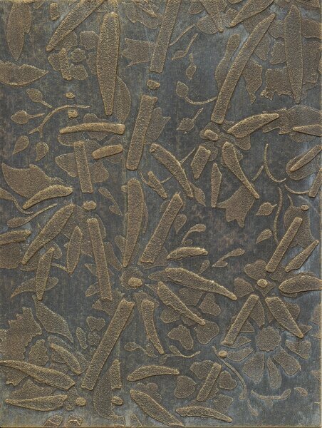
I thought I'd post some more backgrounds. I used the same technique and supplies that I used for the sample cards here:
http://www.scrapbook.com/galleries/13464/view/4938191/-1/54/0.html
The differences are that I used different colors, and I didn't use Oil Pastels. In fact, I only added highlights to the first one.
I used Golden Fluid Acrylics on the first three, and Lumiere on the fourth sample.
1. I first painted with Raw Umber. When it was dry, I added just a bit of Titan Buff, but rubbed most of it off with a babywipe. Then I just a little Quinacridone/Nickel Azo Gold on a dry brush, wiped the brush off on a paper towel, and then brushed it over the Raw Umber. Then I repeated that process with Iridescent Gold Deep (Fine).
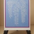
2. I just used Jenkins Green on this one. Where the paste is, the color is lighter so I didn't think it needed highlights.
3. This one is Payne's Gray. I might still highlight this one.
4. This one is Luminere Metallic Rust. It's really lovely. You can't see it here, but the watercolor paper itself is shiny, and the pasted design has a soft shimmer. In real life, they look like two different shades of the same color similar to what you can see on the green card.
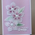
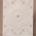
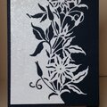
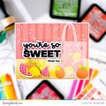
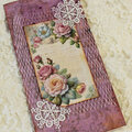
I think these would make great mats and frames on our cards.
TFL.
Daria
No products have been added to this project.


Thanks for spreading positivity!