FREE Standard Shipping on Orders $69+ with code:
FREESHIPPING


Cheers
Be the first to cheer this project!
Give a Cheer
Be the first to cheer this project!

 Give a Cheer
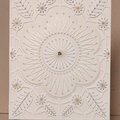
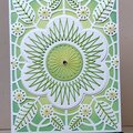
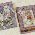
These are my samples for the WSW13 Layered Design Challenge.
Blog: http://www.twopeasinabucket.com/userblogpost.asp?id=71479 [twopeasinabucket.com]
Discussion Thread: http://www.twopeasinabucket.com/mb.asp?cmd=display&thread_id=3239263 [twopeasinabucket.com]
Nora gave me some old magazines, and I saw a fabulous framed collage by Sarah Ogren on page 67 in The Stamper's Sampler, August/September 2007. I thought we could use the technique she used on her frame as a background or frame on our cards. I googled Sarah's name and found her blogspot. I couldn't find the exact piece I saw in the magazine, but I found several other examples of her technique. I contacted her, and she kindly gave me permission to use her work as inspiration for this challenge. Here's a link to a card that is very much like the one in the magazine except for the color. The one in the magazine was in neutrals (black, brown, cream, gold) all blended to a subtle antique look. http://www.sarahogren.blogspot.com/2007_02_01_archive.html [sarahogren.blogspot.com]
Don't laugh. I know that my background didn't turn out anything like Sarah's. I'll keep trying. In the meantime, I like mine too.
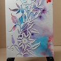
I used 140-lb. cold-pressed watercolor paper instead of the gallery mat Sarah used. It added its own texture which I liked until I added the highlights. When I was making my sample, I almost stopped after applying the first coat of paint, Golden Fluid Acrylic, Raw Umber. I loved the piece just like that, but I kept going, and I ended up with a background that is absolutely nothing like the beautiful subtle piece she made. I found this one Sarah?s blog: http://www.sarahogren.blogspot.com/2007_02_01_archive.html [sarahogren.blogspot.com] This frame is similar to the one I saw in the magazine, but the colors used in the magazine piece were in the neutral tones instead of blue tones.
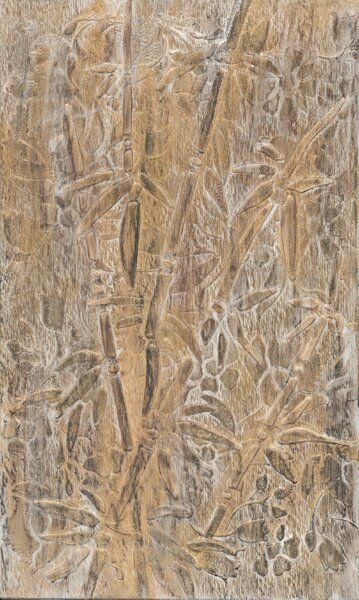
My second sample uses ink instead of paint.
For both cards, I spread embossing paste through one stencil (Chintz) and let that paste dry completely. Then I used the second stencil (bamboo) and repeated the procedure. I used removable tape to secure the stencils so they would not move. Each time, I immediately put the stencils and tools in a shallow dish of soapy water. Then I cleaned them when I was ready. Don't let the paste dry without cleaning it off your tools.
I admit that I liked this project each step of the way. First I thought that the white on white was beautiful. Then when I added the Raw Umber paint, I loved it. I almost stopped right there, but I kept going. I didn't care for the way the oil pastels and the texture of the watercolor paper interacted on the first card–very busy. Maybe I should have used the smooth side. Later I saw a video that said you should press down hard on those pastels. That would have helped fill in the area.
Sarah's Supplies:
Gallery Mat
Stencil Paste
Two different stencils
Acrylic Paints–black and cream
For highlights: Gold Metallic paint (I don't know if this was an acrylic paint.)
Oil Pastels–brown and black
Acrylic Matte Medium
My Cards:
BOTH CARDS:
Bazzill Cardstock (card base and mats)
Abracadabra Stamp Makers
Staz-on Ink–black
Neenah Solar White Cardstock (focal image)
Distress Inks–Walnut Stain and Vintage Photo (1st card); Frayed Burlap and Vintage Photo (2nd card)
CARD #1:
5 5/8“ x 4 9/16”
140-lb. cold-pressed watercolor paper
Dreamweaver Stencils Embossing Paste
Two plastic stencils–Delta One-Step Background Stencil–Chintz; StenSource–Bamboo
Golden Fluid Acrylics–Raw Umber, Titanium White and Titan Buff (mixed to make Cream)
Golden Fluid Acrylic Paint–Iridescent Gold Deep (Fine) (for highlights)
Portfolio Series, Water Soluble Oil Pastels–brown and black (for highlights)
Golden Gel Medium–Soft Gel Matte
CARD #2:
4 9/16“ x 5 7/8”
140-lb. cold-pressed watercolor paper
Dreamweaver Stencils Embossing Paste
Two plastic stencils–Delta One-Step Background Stencil–Chintz; StenSource–Bamboo
Distress Inks–Antique Linen and Frayed Burlap
TFL.
Daria
No products have been added to this project.


Thanks for spreading positivity!