I like this one - so cute to catch these special words as your son grows up. I noticed that you mentioned that this was the first one you journaled and that you had a hard time matching the paper. My suggestion for that is vellum or transparency - you can attach the journaling on the vellum or transparency right onto the layout or onto your paper with an eyelet or just glue. I have no suggestions I like the layout how it is.
What a really great layout. I love the title - will be keeping this idea in mind!! lol... and I think you mixed the patterned paper with the corner stamps really well. The journal block just seems to need grounding, if you kwim - it doesn't look quite like it belongs, like it's floating there. Maybe if you inked the edges to match the title or used the silver again as Karen suggested that would help it feel more at home. I wouldn't necessarily make it any smaller, as your photos and title are all bold - so it ties in. I do really like what you've done though, it's a beautiful page.
It's wonderful - you mixed up the uppercase and lowercase for the titles, greatphoto placement, very pretty paper and ribbons! I don't know if I would go smaller on the journal block as the pics are pretty good size. Maybe some brads on the corners of the journal box to blend with the silver you used with the ribbons or maybe a little ribbon bow on the journal box. The paper is very pretty I think!
I like this LO! I love the colors you went with. I agree with you about the journaling. I too would go a bit smaller. I like the way you did the ribbon and the charm. Good job!
It looks great and the journling will be so fun to have as your son gets older!! You might try using blocks and patterned paper and blocks of cardstock as your backgroup rather then whole peiced of pp-- just to mix up the looks of your layouts a bit. I LOVE the way you did the ribbon and the charm!!
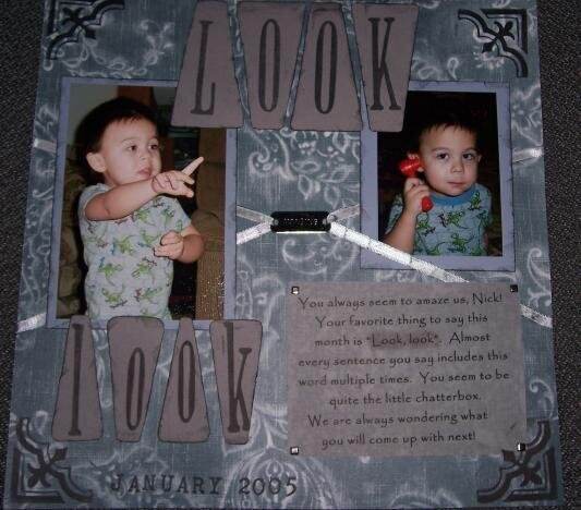
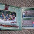
This is the first lo I have ever done with journaling. If I would do it over, I would make the text smaller. I also had problems finding cardstock or other pp to match.
I added the date and silver square brads (thanks for the suggestions)
Metal charm says "IMAGINE"
Supplies used: Making Memories pattern paper - studio nightfall lg. paisley distressing ink - black soot MM foam stamp philly upper & lowercase MM foam corner stamp white satin ribbon (stamped black) metal "imagine" charm - JoAnn Essentials vellum chatterbox paper behind vellum cardstock chalk (used to highlight "look, look" in journaling) silver square brads
Does this project or one of it's images contain pornography, profanity, or other illegal or offensive material? If so, please report it and our moderators will come by and clean it up in a flash.
January 10, 2005
January 07, 2005
January 06, 2005
January 06, 2005
January 06, 2005
January 06, 2005
January 06, 2005
January 06, 2005
January 06, 2005
January 06, 2005