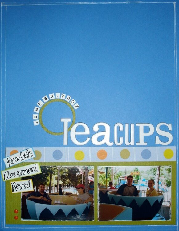
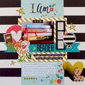
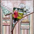
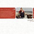
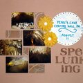
CS~Very cute! I agree that there is a lot of space at the top. Maybe you can add a another strip of the circle paper as a border about an inch from the top?
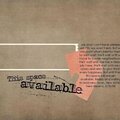
i know your in a rut, and this lo looks great. but all your photos seem on the small side, i know you do letter size lo's but what about blowing a photo up to a wierd size, like 2.5 x 8 and using that...im might give you a different perspective and force something different out of you.
*CS* There is a lot of white space up top but I think it looks good. Maybe you just are not use to having that much open space. I say leave it as it and if you just HAVE to do something experiment with coloring the title a yellow or something. I think this lo is super neat though
Does this project or one of it's images contain pornography, profanity, or other illegal or offensive material? If so, please report it and our moderators will come by and clean it up in a flash.


 Give a Cheer


November 07, 2007
October 29, 2007
October 04, 2007
October 03, 2007
September 29, 2007
September 28, 2007
September 28, 2007
September 28, 2007
September 28, 2007
September 28, 2007
September 28, 2007