SHCG: I don't care if you have already used this photo. It is such and adorable photo and this is a whole new spin. The monochromatic hues totally rock. My only suggestion would be to add a grayish photomat to the photo. This is fabulous!
SHCG: You forgot that you scrapped this photo? You just can't get enough to fill your Tank is all! Heh-heh. Kudos to your bf for the perfect title. Great page going monochromatic in shades! Love the ribbon and pp, the glittery title, and the added flower centers. I'd anchor the flowers together with stamped flourishes that go wildly up toward the upper right white space of the page, and continue with more onto the pp coming out from under the bottom left of the photo. Others may urge you to try a tad of color or white to make the photo pop, but I'll offer a suggestion in keeping with your desire to stay true to your color scheme--do the flourishes in silver embossed ink.
SHCG - Tank is so beautiful, it's worth it to re-scrap great photos of him! I love the elegant, monochromatic look here - the patterns, trimming, title & embellies are lovely & very complementary to the b&w pic. I agree that a white photo matte, or perhaps some white doodles around the pic, would add a perfect accent & emphasize Tank more as the star of this LO. Overall, fantastic scrapping!
SHCG: You may have used this photo before but its worth using again. I love the colors you picked, it goes well with the title. I too agree with the cream photo mat to make it pop with still staying subdued.
SHCG: This is a great photo!!! I agree with adding maybe a very thin white or cream photo mat. Just to make the pic POP. Maybe bunching the flowers together so they don't look like they are "floating." I love the monochromatic scheme.
SHCG: Another adorable puppy pic! I love the monochromatic black going on here, that paper is awesome! I do agree with the other girls, maybe adding some white in it would make the photo pop more, maybe some white photo corners, white flowers or white doodling around the pic :)
SHCG: Cute pic! I agree with Janet that I'd love to see a touch of color, or even a touch of white within this layout to break it up a bit. Also I think the topmost small flower (between the two large ones) could use to be moved to the left below the other two small flowers to complete the framing element they give the picture.
SHCG: This is a great puppy photo and I totally understand why you love it. While I too love the monochromatic look, I think a TOUCH of color would do this page wonders... perhaps just ONE element (the ribbon, the title OR a flower or two). I am thinking RED might look good and be dramatically bold too.
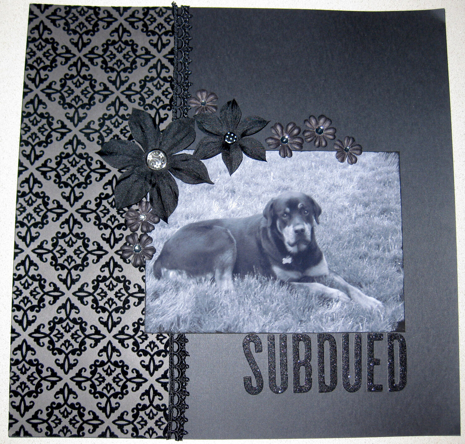
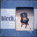
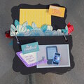
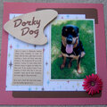
Eh... sorry for the bad picture, it looks much better IRL! This was inspired by Rebecca/byondbzr's love at first sight LO. I love using black and love the look of the monochromatic black. I have to give credit to my bf for coming up with the title. :)
Does this project or one of it's images contain pornography, profanity, or other illegal or offensive material? If so, please report it and our moderators will come by and clean it up in a flash.
March 01, 2009
February 18, 2009
December 08, 2008
December 04, 2008
December 02, 2008
November 30, 2008
November 27, 2008
November 26, 2008
November 25, 2008
November 25, 2008
November 24, 2008
November 24, 2008