

Thank YOU! It's Customer Appreciation Week!
EXTRA 11% OFF Orders $100+ With Code: THANKYOU
EXTRA 11% OFF Orders $100+ With Code: THANKYOU


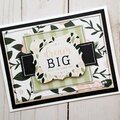
 Give a Cheer
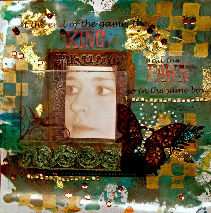
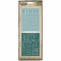
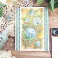
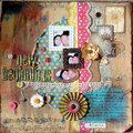
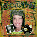
I made the background on this page using food color droplets on white clayboard. I then added the checkerboard stamps using gold paint and "blobs" of gold embossing powder.

Thanks for spreading positivity!


November 28, 2010
November 27, 2010
November 26, 2010
November 11, 2010
November 07, 2010
October 31, 2010
October 31, 2010
October 29, 2010
October 27, 2010
October 27, 2010
October 27, 2010
October 27, 2010
October 27, 2010
October 27, 2010
October 26, 2010
October 26, 2010
October 26, 2010