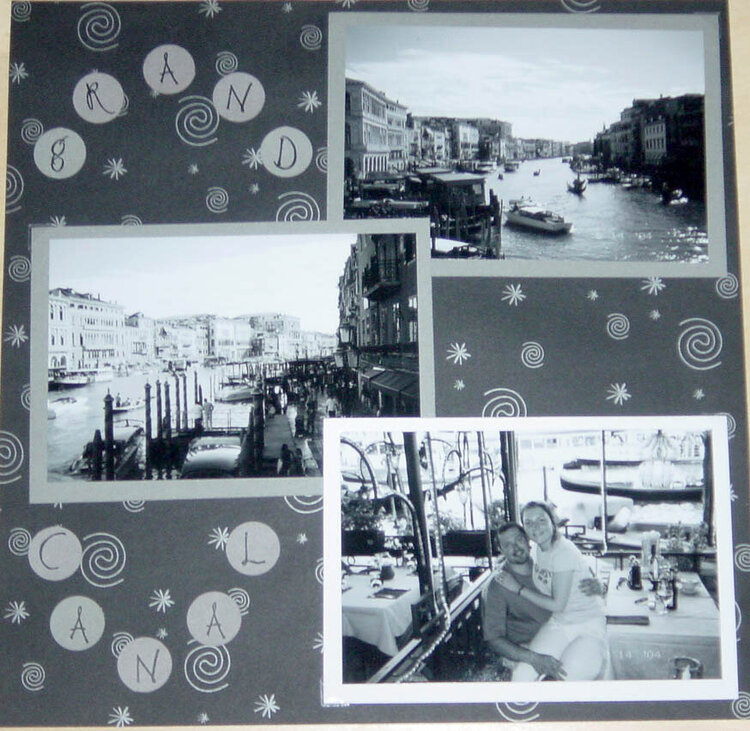
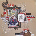
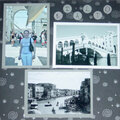
love the b/w pics! I used the same pp for a LO too!! It's amazing how the same pp can be used on different LO and they are both wonderful! Check it out: http://www.scrapbook.com/galleries/155091/view/754729/-1/0/1.html
I like the way you displayed the pics. Love the black and white! For me the title is hard to see. It kind of gets lost with the swirls. You could add larger colored circles behind your letters. Might make tham stand out a bit. :o}
Love the black and white. With B&W LOs, adding a touch of red or any bold color here and there and around the pics, draws attention towards where it is, and makes things sort of pop. great LO, just some future tips!
Does this project or one of it's images contain pornography, profanity, or other illegal or offensive material? If so, please report it and our moderators will come by and clean it up in a flash.


 Give a Cheer


May 22, 2007
April 09, 2007
April 08, 2007
April 06, 2007
April 05, 2007
April 04, 2007
April 03, 2007