SHCG: This is so nice, all the pictures are great and nice that you have memories of each house! I love the background paper so much, goes perfectly for this. I agree with the others about the bottom picture, I suggest turning it a little more to the right. Great job :)
SHCG: Perfect background paper. Interesting to see the various homes over the years. I like colored number square I just which there was a ledger saying what each number was (or where it was). The angle of the one photo threw me at first, my first reaction was earthquake. But then I saw it was two photos of the same house.
SHCG: I agree that the LL photo being askew throws off the page... is it askew because it's the same house as the one above it? Maybe you could have made that photo smaller and placed it just a little bit angled and overlapping the one above it. That would also leave some room for a cute embellie in the corner to balance out the title in the UR corner. I really like the pp you used and I am impressed with the fact that you have photos of each place!
SHCG: This is such a thoughtful idea for your brother. I like the bg pattern and that you numbered and dated each photo. I still think the placement needs reconsidering in terms of the one photo askew, and the second photo being top heavy over the fourth and fifth. I can see you creating a larger mat to the title and adding some brads or hinges in keeping with house hardware. These might help give the illusion that the smaller pics are the same size as the others.
SHCG: What a great idea for the book! I love all the photos, but like the rest I'm a little thrown off by the bottom left pic. I also wish to see some more red-very nice accent color here!
shcg: very cool page for the book. i agree with sharon on the one pic throwing off the balance of the lo for me also. i wish that each home had the city/state associated written like you did with the last two.
SHCG - Great idea for your bro's book! Such a cool trip down memory lane for him, love how you captured this in photos & the documented dates. You created such a nice clean look w/ the orderly matting & placement that the angled placement of one element, the bottom #3 pic, throws me off... if #3 is to apply to both those pics, I could see straightening the bottom pic & putting the #3 in between the pics somewhere near their right sides. I like how the left column of 3-pics is slightly higher than the right column, that adds good visual interest in the placement. I could see maybe having each column make a subtle staircase-type placement, that is - the top pic left most, the middle a little to the right & the bottom the rightmost, you know? Just to jazz things up but keeping the neato linear look you established. Groovy & thoughtful page, Michelle!
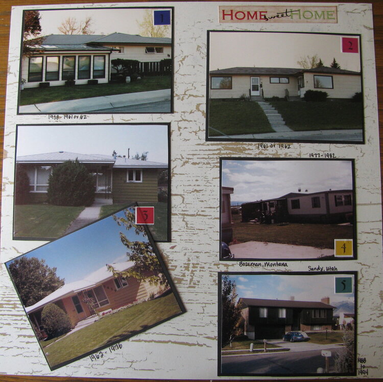
For my brother's book. Pictures of all the homes he lived in up until he got married. I had to guess at the time frames for some of them but it gives everyone an idea of how long in each home.
Does this project or one of it's images contain pornography, profanity, or other illegal or offensive material? If so, please report it and our moderators will come by and clean it up in a flash.
October 19, 2009
October 09, 2009
October 05, 2009
October 02, 2009
October 02, 2009
October 01, 2009
September 29, 2009
September 27, 2009
September 26, 2009
September 26, 2009