Thank YOU! It's Customer Appreciation Week!
EXTRA 11% OFF Orders $100+ With Code: THANKYOU
EXTRA 11% OFF Orders $100+ With Code: THANKYOU


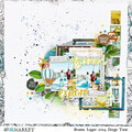
 Give a Cheer
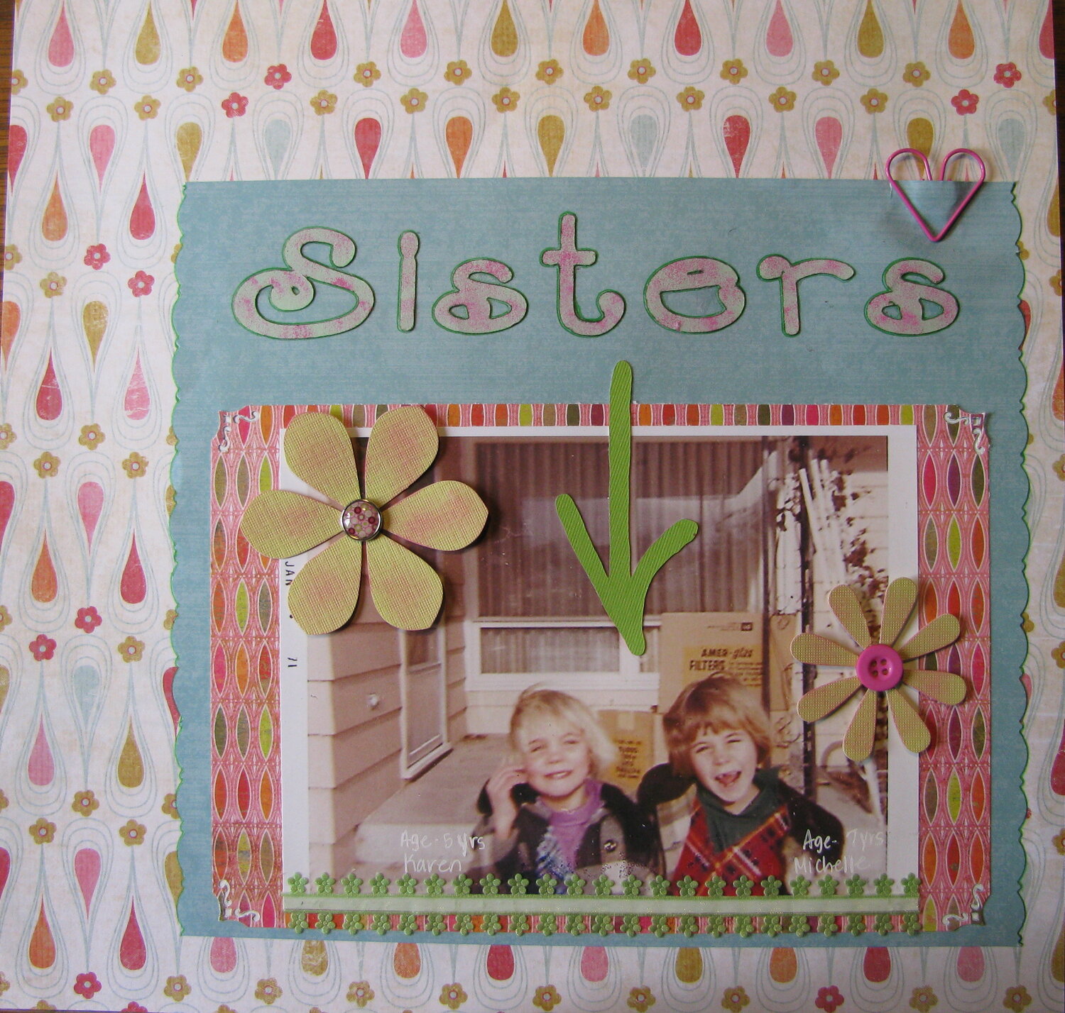
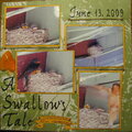
I revisited this LO with some suggestions from the Fab SHCG. May have to adjust more later.
This LO is in response to a SHCG Challege. I had started this LO with another picture, then realized I had already used the photo. So I scrambled and found this picture of my younger sister and myself. The coloring and style of the papers I "chose" reminded me of an "older" period. I inked the letters and the paper flowers to give it a bit more flow. The arrow....I can't decide if I should ink it or let it be as the ribbon on the bottom is about the same color.
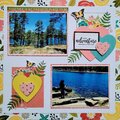
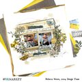
No products have been added to this project.

Thanks for spreading positivity!


July 14, 2010
July 07, 2010
June 29, 2010
June 20, 2010
June 17, 2010
June 13, 2010
June 11, 2010
June 07, 2010
June 07, 2010
June 06, 2010