Storage & Organization up to 60% OFF!
Plus, a FREE Gift! | Details Here.
Plus, a FREE Gift! | Details Here.

 Give a Cheer
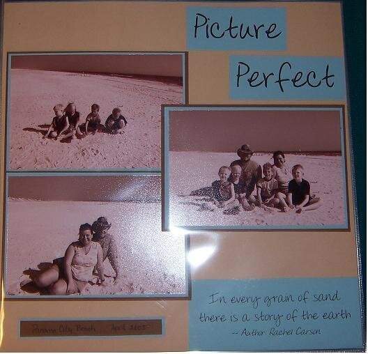
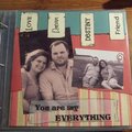
These are pitures of my family at Panama City Beach in April 2005.
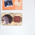
Journaling block says
"In every grain of sand there is a story of the earth" Rachel Carson
No products have been added to this project.


Thanks for spreading positivity!


August 11, 2005
August 08, 2005
August 08, 2005
August 06, 2005
August 06, 2005
August 06, 2005
August 05, 2005
August 05, 2005
August 05, 2005