Storage & Organization up to 60% OFF!
Plus, a FREE Gift! | Details Here.
Plus, a FREE Gift! | Details Here.

 Give a Cheer
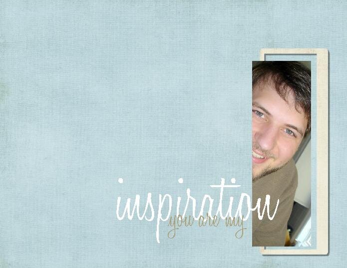
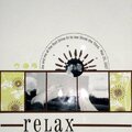
My hubby!!! TFL!
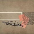
This was inspired by Warrior Princess' layout entitled "True Expressions" which is just beautiful!! Thank you!
No products have been added to this project.


Thanks for spreading positivity!


May 09, 2008
May 07, 2008
May 05, 2008
May 04, 2008
May 03, 2008
May 03, 2008
May 03, 2008