FREE Standard Shipping on Orders $69+ with code:
FREESHIPPING

Cheers
Give a Cheer

 Give a Cheer
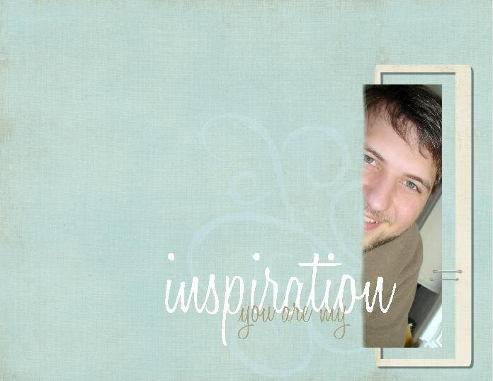
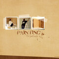
This is a quick revision of a page I did earlier today. I felt it was missing something, and I am very pleased with what I changed.
I changed the shape of the photo, blurring the left side.
I added a muted flourish.
I added staples.
Oh, and I changed the background from Happy As a Lark to Fresh Linens... both Paislee Press
TFL!! Comments and suggestions always appreciated. :)
No products have been added to this project.


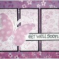
Thanks for spreading positivity!


May 11, 2008
May 07, 2008
May 05, 2008
May 05, 2008
May 04, 2008
May 04, 2008
May 04, 2008
May 04, 2008
May 04, 2008
May 04, 2008
May 04, 2008
May 04, 2008
May 04, 2008