This turned out terrific! I like the color photo as it draws the attention better than the b/w. I really like the bright colors mixed with the black, and the way they point to the photo. Congrats on your achievement, too!
I like the color photo better but they both look great. I agree with Jeanne too - the black with the pp is very striking and effective. I remember that pp. lol
Love that you used patterned pp with the black...very cute and colorful..great lift a lift of a lift..maybe of another lift..may be one of those layouts that does the rounds.
I like the black and white photo. It puts the focus on you and your mom more. When I flipped between the two, my eye went to the background in the color photo. Just wanted to share what I thought. I know sometimes it's hard to decide. Congratulations on your black belt degree. That is major! I love how playful your page is with the skull and crossbones. Thanks for sharing!
They are both wonderful, but I like the color photo best. You played off of the photo colors, and they blend perfectly in your design. Congrats on the black belt
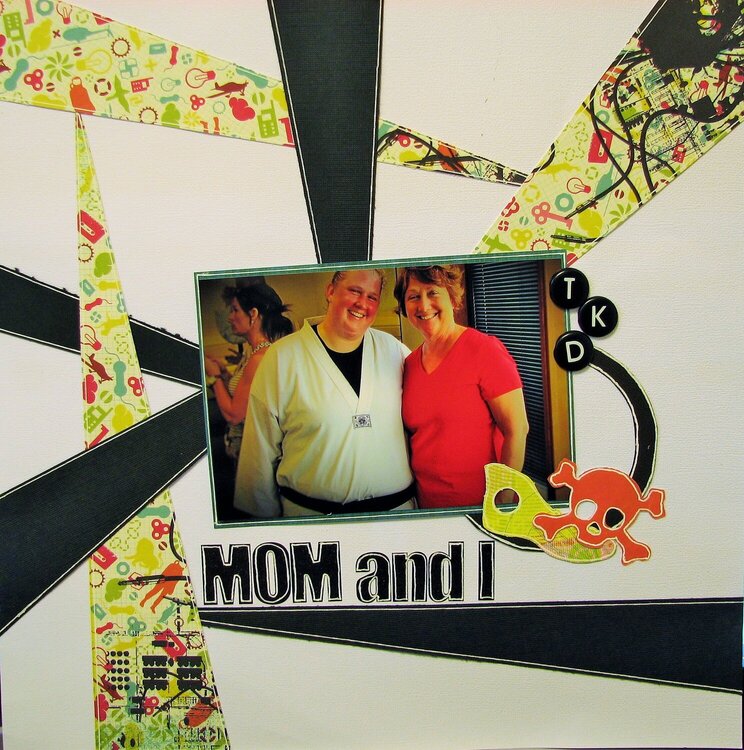
I can't decide between the color photo or the black and white one. This was after my 2nd degree black belt test of my mom and I, she's been at every one of my testings which by now is a total of 11.
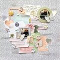
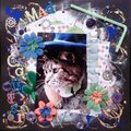
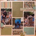
For the gallery inspired challenge I lifted Dollscrap's Moody Blues.
Does this project or one of it's images contain pornography, profanity, or other illegal or offensive material? If so, please report it and our moderators will come by and clean it up in a flash.
August 29, 2015
August 17, 2015
August 09, 2015
August 03, 2015
August 02, 2015
August 02, 2015
August 02, 2015
August 02, 2015
August 02, 2015
July 31, 2015
July 31, 2015
July 31, 2015
July 31, 2015
July 31, 2015
July 30, 2015
July 30, 2015
July 30, 2015
July 30, 2015
July 30, 2015
July 30, 2015
July 30, 2015
July 30, 2015
July 30, 2015
July 30, 2015