Thank YOU! It's Customer Appreciation Week!
EXTRA 11% OFF Orders $100+ With Code: THANKYOU
EXTRA 11% OFF Orders $100+ With Code: THANKYOU

 Give a Cheer
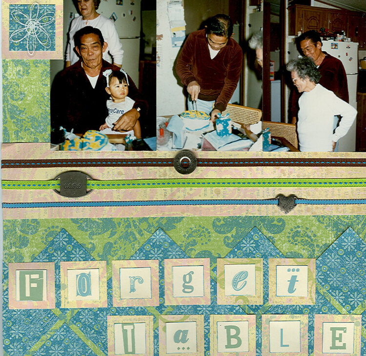
2 page lo.
No products have been added to this project.

Thanks for spreading positivity!


February 20, 2006
February 19, 2006
February 18, 2006
February 18, 2006
February 18, 2006