Thank YOU! It's Customer Appreciation Week!
EXTRA 11% OFF Orders $100+ With Code: THANKYOU
EXTRA 11% OFF Orders $100+ With Code: THANKYOU

 Give a Cheer
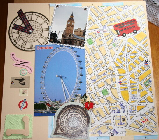
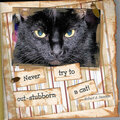
This is the very first LO I ever did!!
No products have been added to this project.

Thanks for spreading positivity!


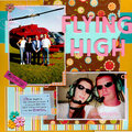


February 14, 2006
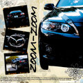
February 10, 2006
February 04, 2006
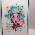
February 03, 2006
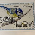
February 02, 2006