CHT: I'm currently in this b/w (with a hint of color) and polka dot phase, which has giving me serious issues with color, btw, which is why I find your lo appealing. The words you use to describe yourself might very well describe me, too. I also like the title font and the Celtic knots. I agree that your page does need a hint of color since your focal image is also b/w. I'd probably go with some kind of soft turquoise for that polka dot mat (keep the polka dots), and for the center circles of the flowers, maybe. Also, your subtitle could stand to be more prominent, it seems to shrink into the page.
CHT: I for one LOVE the monochromatic theme!! lol However, I agree that there is no real focus. Id move the descriptive strips closer to the matted drawing (maybe overlapping some on the mat and pic??) to bring then focus to this area of the page and leavin more white space on the edge od the LO. The drawing is fantastic!!!
CHT: I love the whole layout, the placement of everything, the matting and flowers. The one thing that I thought of when I first saw it, though, is that it is a little bland because there is no color anywhere. Because it's all monochromatic, I didn't feel like my eye was drawn anywhere, that I kind of wandered around the page. I would try adding a bit of color to the photo mat, to see if that makes the picture more of a focal point.
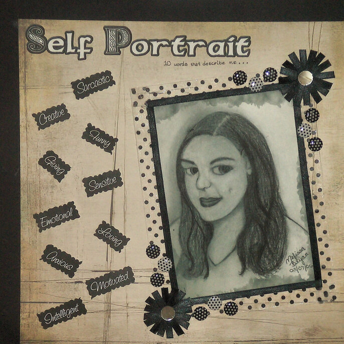
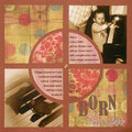
I decided to do this page using a self portrait sketch I did earlier this year. I thought doing it monochrome would really look nice since the sketch was black and white, plus I got to use some cute embellishments that I found in a dollar bin at Michael's!
Does this project or one of it's images contain pornography, profanity, or other illegal or offensive material? If so, please report it and our moderators will come by and clean it up in a flash.
April 22, 2008
July 14, 2007
January 14, 2007
January 08, 2007
January 08, 2007
January 08, 2007
January 08, 2007
January 07, 2007