Livestream Party!
Join us today at 9:00am PT / 12:00pm ET | Details Here.
Join us today at 9:00am PT / 12:00pm ET | Details Here.

 Give a Cheer
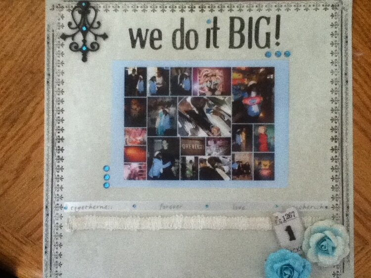
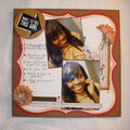
This is a LO of my daughter and her boyfrined on their 1 monthiversary at the wax museum. I am going to go in and add their names and date
No products have been added to this project.


Thanks for spreading positivity!


August 28, 2011
April 14, 2011
March 20, 2011
March 16, 2011
March 10, 2011
March 10, 2011
March 06, 2011
March 02, 2011
March 01, 2011
February 28, 2011