FREE Standard Shipping on Orders $69+ with code:
FREESHIPPING

Cheers
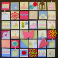
Give a Cheer

 Give a Cheer
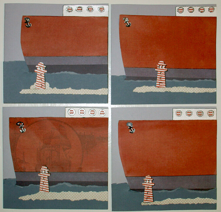
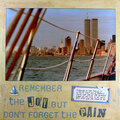
Quickutz - slightly modified LIGHTHOUSE and tiny ANCHOR (cruise ship) die cuts. Dimension to lighthouse is created with additional die cuts.
Paper - DCWV Nantucket stack.
LARGE blank area (the large Ship) is for the custom message for each card.
The watercolor painting that was inspirations for this card. http://pinterest.com/pin/232943801/
No products have been added to this project.


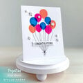
Thanks for spreading positivity!


November 17, 2011
November 06, 2011
October 31, 2011
October 29, 2011
October 28, 2011