SHCG: I'm with everyone on the simple look, looks good. As for suggestions, I don't have any to offer that are different from ones already suggested. I like that you included a more personal candid shot, to lighten the more photojournaling architectural shots.
SHCG: The simple look works really well here really like your black matts they add a lot to the page. would also like to see more of that beautiful blue around the page to balance it out.
SHCG - Simple works well w/ this LO. I like how the background paper is reminiscent of old buildings. The black matting looks classic & classY. I like that you used the brochure. I can imagine adding a couple of elements that continue the historic architecture that already appears in the pics, like maybe swirly corner embellies in the top left/lower right that look like an ornately carved doorway, something like that. Really like the elegance you have already going here.
SHCG: I think this is just fine without additional embellies. It's got a very simple feel that doesn't need additional details. I think Chris has a good idea about using a pp with more blue in it to help the brochure feel more included. I don't know if you have a large format printer, but if you do, I could see a page like this done on a sheet of solid cs with one element printed out very lightly in grayscale to make a background... like using the picture on the top center cropped in a bit and printed all down the side of the page. I hope I'm making sense!
Great photos of the Smithsonian and the background paper is a great choice for an architechtural piece. If you simply search the word architechural on this site, it will pull up embellies that would work beautiful with you photos. A lot of them are Prima. I love it you included the brochure.
shcg - I like the idea of this layout. The simple look WORKS for the photos, and the black matting is classic for them, as well. What keeps distracting me is the brochure. The bright blue pulls my attention away from the photos, and I'm wondering if you'd used more blue in the layout (as opposed to the browns) if that would have made a difference. It also feels like the left side is a bit heavier than the right (everything seems closer to that edge in an otherwise block layout). Hope this helps!
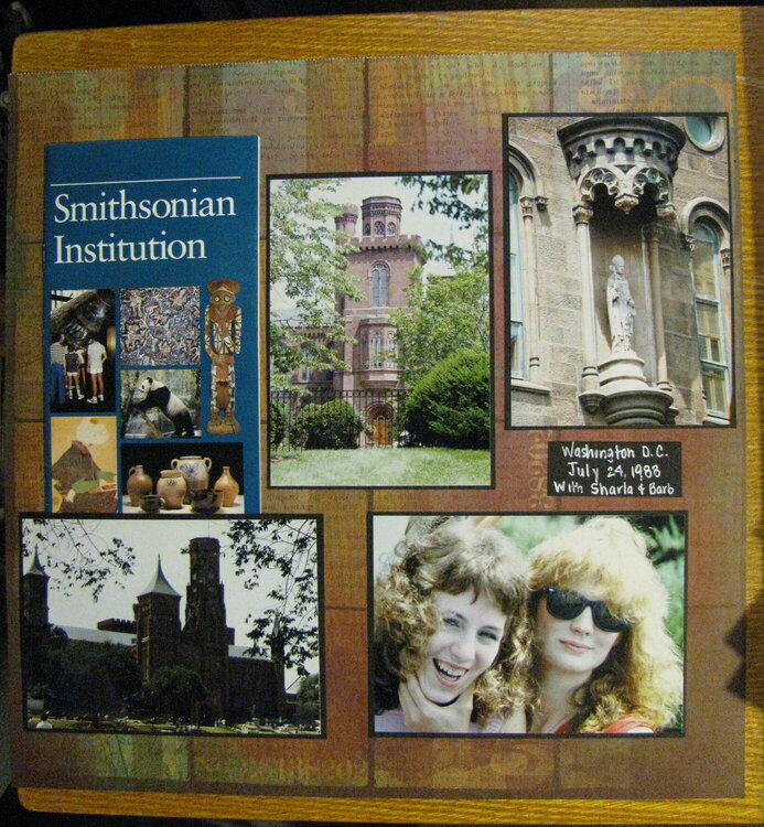
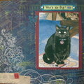
I had a difficult time figuring out how to do this LO. It ended up very simple with a classic look (the black matting) I have no idea what kind of embellies or other things that could be added to this (and I have several more LO's to do from some of the other buildings). Suggestions welcome.
Does this project or one of it's images contain pornography, profanity, or other illegal or offensive material? If so, please report it and our moderators will come by and clean it up in a flash.
April 01, 2012
February 08, 2012
February 03, 2012
February 02, 2012
January 29, 2012
January 29, 2012