Thank YOU! It's Customer Appreciation Week!
EXTRA 11% OFF Orders $100+ With Code: THANKYOU
EXTRA 11% OFF Orders $100+ With Code: THANKYOU

 Give a Cheer
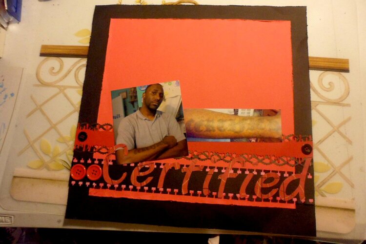
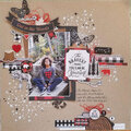
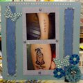
this is my bestie and his tat. he gave me permission to use his photos and share it with all of you.
july round robin - week 1 group 1 - lift a lo in your gallery of yours. i lifted may ugly paper http://www.scrapbook.com/galleries/125607/view/3632823/-1/20/1.html
No products have been added to this project.
Thanks for spreading positivity!


August 17, 2012
August 01, 2012
August 01, 2012
July 26, 2012
July 25, 2012
July 24, 2012
July 18, 2012
July 18, 2012
July 17, 2012
July 14, 2012
July 14, 2012
July 14, 2012
July 12, 2012
July 11, 2012
July 11, 2012
July 11, 2012
July 11, 2012
July 11, 2012
July 11, 2012
July 11, 2012
July 10, 2012
July 10, 2012
July 10, 2012
July 10, 2012
July 10, 2012
July 10, 2012
July 10, 2012