Storage & Organization up to 60% OFF!
Plus, a FREE Gift! | Details Here.
Plus, a FREE Gift! | Details Here.


Be the first to cheer this project!

 Give a Cheer
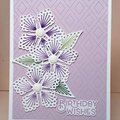
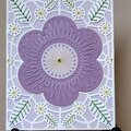
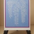
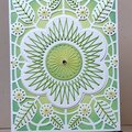
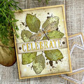
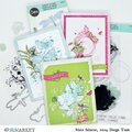
I made these backgrounds (below) and this card for my AIR16 Nighty-Night Challenge (Pillow-Top Background Technique). I learned this technique from Gina K.'s video tutorial on Stamp TV.
The background is actually a soft version of the same green that is on the leaves. It did not photograph well.
CARD:
4 ¼ x 5 ½
Card base and mat--Bazzill cardstock, Red Devil
BACKGROUND:
Pillow-Top Technique
Neenah Classic Crest Solar White 80-lb. Cardstock
Memories Ink, Soft Sage (For Hero Arts Shadow Stamps)
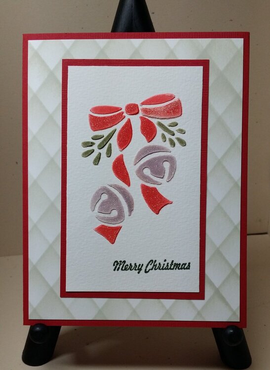
FOCAL IMAGE:
Canson 90-lb. Cold-Press Watercolor Paper
Just Rite sentiment--Christmas Antique Labels One
Versafine Ink--Olympia Green
Darice brass stencil--Xmas Bells/Bow, 1020-63
Kaleidacolor Ink Pads--The red is a mixture of the darkest colors in the Tomato Vine and Desert Pink pads. The bells are colored with a mixture of a lavender and a grayish color.
Wink of Stella--Clear
I stenciled in the color first, and then I paste embossed.
I added glitter to the wet paste, but the paste was on the dry side, and the glitter didn't stick. (I also brushed off the excess before the paste was completely dry. That might have had something to do with it's not sticking.) I used clear Wink of Stella once the paste was completely dry.
TFL.
Daria
ETA: (07.06.16) I learned a lot while making backgrounds for a this challenge and thought I'd share some more tips here in case anyone comes to this thread to learn how to do this technique:
1. I found I liked the effect best with lines that were not too far apart. I settled on a half inch space between them.
2. I also am now using a glass mat that has grid lines on it. That way, I can temporarily attach the cardstock to the mat so that the opposite corners line up with the same grid line and just move the piece of plastic. I mentioned this to Cindi, and she suggested putting the grid paper in a page protector if you didn't have a glass mat. Great idea!
3. The ink applicator that worked the best for me was Tsukineko's Ink Sweeper, the long, thin ink dauber. However, start out using what you are accustomed to. It will probably work best for you.
4. The hardest part for me was to use a light hand. No pressure. I tapped the ink onto the plastic along the edge and then very lightly transferred it to the cardstock. I had to keep reminding myself to go slowly and not to press down. It worked better to just go over it a couple of times instead of pressing down to apply ink.
5. I had great luck using Memories Inks Made for Hero Arts Shadow Stamps. Yep, that's what they were called. The colors are soft. The nice thing about this technique is you can make it what you want, whatever suits the mood of your card--pastel or bright, soft or vivid, serene or wild.
6. One more thing. My rejects, even the worse one, looked great when die-cut with an intricate die. I used a sentiment die.
Have fun.
Daria
No products have been added to this project.
Thanks for spreading positivity!