Livestream Party!
Join us today at 9:00am PT / 12:00pm ET | Details Here.
Join us today at 9:00am PT / 12:00pm ET | Details Here.
 Give a Cheer
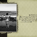
Well, I've decided to scrap my pictures backwards, the last thing we did to the first thing. I figure the more recent things are still fresh in my mind and either way I do it, I'm going to have to really think about the details of the first week ;)! Technically, it's still in order :)
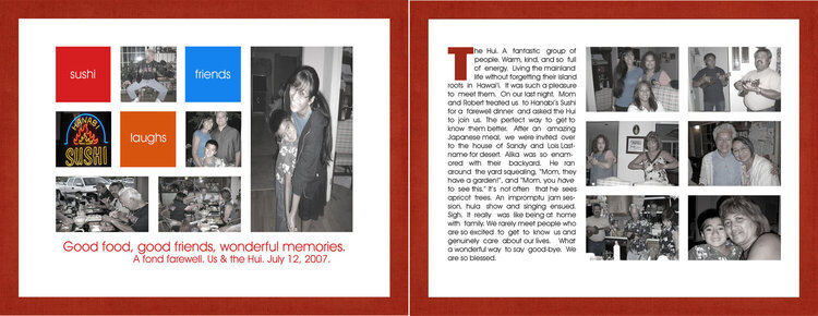
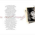
So my mother took my family out for dinner on our last night in Cali, and brought along her friends from the Hui (it means group/club of people in Hawaiian). They are the most amazing people. It was good for my soul to see that there are still people like them existing in this world!
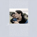
So the LO is a two pager, very clean. I've come to realize that the only way I can do a LO with multiple pictures is when I keep it simple. Get ready to see some sparse layouts - *LOL*! I also desaturated all the photos to give it a more uniformed look (except for the photo of the sign, it's how I got my color palette). Thanks for Looking!
P.S. Do you think I should change the text coloring on page 2? I struggled a bit with it. And I forgot to copy and paste, if you zoom the journaling is legible.
No products have been added to this project.


Thanks for spreading positivity!


August 03, 2007
July 30, 2007
July 22, 2007
July 17, 2007
July 17, 2007
July 17, 2007
July 16, 2007
July 16, 2007
July 16, 2007
July 16, 2007
July 16, 2007
July 16, 2007
July 16, 2007
July 16, 2007
July 16, 2007
July 16, 2007
July 15, 2007