

Thank YOU! It's Customer Appreciation Week!
EXTRA 11% OFF Orders $100+ With Code: THANKYOU
EXTRA 11% OFF Orders $100+ With Code: THANKYOU

 Give a Cheer
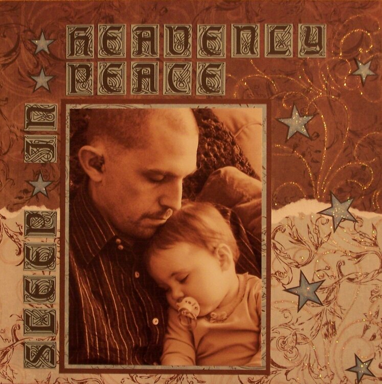
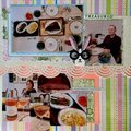
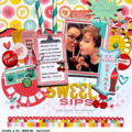
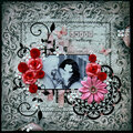
This is my husband and my daughter catching a nap this afternoon. I snapped it and thought it would be perfect for the Christmas song challenge, hence the title. I'm still working on taking straight pictures...anyone have tips for that? The lighting is a little off. The top is a deeper chocolate brown and the bottom is a light blue, although it looks almost white. I used glitter to enhance the already existing flourishes on the paper.
Thanks for stopping by!
Thanks for spreading positivity!


July 16, 2011
January 14, 2009
September 14, 2008
April 30, 2008
March 01, 2008
February 14, 2008
February 11, 2008
February 06, 2008
February 04, 2008
January 31, 2008
January 27, 2008
January 13, 2008
January 07, 2008
January 07, 2008
January 07, 2008
January 07, 2008
December 31, 2007
December 23, 2007
December 23, 2007
December 23, 2007
December 23, 2007
December 19, 2007
December 18, 2007
December 16, 2007
December 16, 2007
December 16, 2007
December 16, 2007
December 15, 2007
December 14, 2007
December 14, 2007
December 13, 2007
December 13, 2007
December 13, 2007
December 12, 2007
December 11, 2007
December 11, 2007
December 11, 2007
December 11, 2007
December 11, 2007
December 10, 2007
December 10, 2007
December 10, 2007
December 10, 2007
December 10, 2007
December 10, 2007
December 10, 2007
December 10, 2007
December 10, 2007
December 10, 2007
December 10, 2007
December 10, 2007
December 10, 2007
December 10, 2007
December 09, 2007
December 09, 2007
December 09, 2007
December 09, 2007
December 09, 2007
December 09, 2007
December 09, 2007
December 09, 2007
December 09, 2007
December 09, 2007
December 09, 2007
December 09, 2007
December 09, 2007
December 09, 2007
December 09, 2007
December 09, 2007