|
ChristineY's Reviews
-
Not good (16 November 2012)
This is the first bad review I have ever given any product I purchased from Scrapbook.com. I bought the paper from this same collection, and I was very pleased with that, but these cardstock stickers are not made of the same paper as the rest of the collection. They have a slight gloss texture and are a couple shades different than the corresponding papers.
-
Doesn't adhere to paper (19 December 2010)
I pushed really hard, and rubbed hard, but still the words did not adhere to my cardstock. At one point I got part of the image to adhere, but that's not what I wanted. I tried two times and then I got sick of ruining my projects and gave up.
-
Looks pretty, doesn't work right (23 November 2010)
I had a really great experience with another EK success border punch that I bought, the medalion chain, so I purchased this one with confidence. It is much smaller than the other punch, and that would not be a problem, but I have tried this punch on all weights of paper and cardstock, and it sticks..you cannot move the paper through it. parchment paper, text paper, newspaper, and 8 weight cardstock...they all stick. Only when I bang it on my table top, does the paper come free. Then when lining up the next row of punches, it is nearly impossible to get them right. The lattice holes are too small to see under the punch mechanism. Even when I line it up with the grid on the punch, I end up skipping spaces or repunching, whick leaves a big uneven square. I have loved nearly everything I have ordered from Scrapbook.com, but I really hate this punch.
-
Nice color, too thick to work with (20 July 2014)
I ordered this twine thinking it would be like the doodle bug twine I have already. It is really too thick to layer on my projects. It makes the cardsock stick up off the paper when layering. It's a nice color, and if you are not using it on paper crafts, I suppose it would be good twine.
-
Not high quality (12 March 2011)
I am always in the market for novelty file folders. I find it gives me a bit of a lift during the work day if I have a nice printed file folder for my work. I have purchased other sets of file folders from other companies, but this is the first time I purchased from DCWV. These are very pretty, but they are just not high quality. They are very flimsy, and not thick enough to protect the files you place in them. I will use them for older files in my filing cabinet, but I can't use them for transporting my files from meeting to meeting.
-
Not as nice as the paper (12 March 2011)
I have to say, I love, love, love this line of paper. I have the 12x12 pad and use it constantly for cards. The colors are subtle, but so pretty. But these stickers are not really the same color as the papers. The designs are the same...but the colors don't match exactly with the papers. They are not horribly mismatched, just not a perfect match. And I specifically bought the stickers in this Linen closet line so I would have embellishments for my cards. So I was a bit disappointed in them.
-
Not what I expected (22 May 2011)
I suppose I might be asking for too much in a craft knife, but I thougth it would be sharper at the tip, and on the blade. I was trying to cut out a circle about an inch around, and I had to run over the paper serveral times, and it still cam out jagged and rough. Maybe there is not knife that could cut a circle that small, or maybe it's my technique, but so far, it's not what I wanted.
-
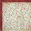
Hard to see (26 September 2010)
This paper is a really good quality, but the problem is you really cannot identify the glazed design. It would probably make a nice background, but people would not be able to tell the design was holly leaves.
-
Bright shades of green (27 July 2010)
This paper is a nice quality, but I liked the way it is pictured on the sight much more than when I saw it in person. The leaves are very cartoon looking, not realistic or even stylized at all. The greens range from a dark kelly green to an almost lime green. I am sure it would look great on a summer or spring page layout, but it was not what I expected.
-
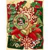
Classic die cuts. (06 September 2011)
Not only would these embellishments coordinate with the rest of the Glad Tidings Collection...they look good with Graphic 45 papers and Basic Grey's jovial collection. MY only complaint and it's a small one. A few of the die cuts are too fully formed...too much like a manufactured card. Namely the Christmas Tree, the Stocking, and the big poinsetta. Other than those, I am sure I will use all of these on my cards this year.
-
Very Christmas (31 October 2010)
This paper is a really pretty pattern...the red is very traditional Christmas red. It will be very nice on the cards I am making. One note, the flocking is more like a rubberized raised finish. It's not the usual flocking you see on some other papers. It's the only reason I give it 4 starts instead of 5. I just don't think it should be discribed as flock.
-
Delicate glitter (18 October 2010)
This paper is so pretty! The borders are beautiful, and I will use thim as a separate accent on my cards. The flowers on the white make it look really delicate. One warning, and why I gave it 4 stars instead of 5, the glitter is a bit messy. It's the kind that comes off on your hands when you move and touch it.
-
kind of glazed off white (18 October 2010)
This paper is not what I expected from the picture. The shapes take on a kind of glossy look. Perhaps I misunderstood the discription. And most of this big schroll that is in the corner of the paper is blocked by the turned up piece showing the back of the paper. That schroll will force me to waste 1/4 of this paper. It would be nice for a layout where you could place a picture inside the schrolled frame like shape...but for card making, it's not too perfect.
-
Ivory accents (08 October 2010)
These borders are made of a good quality paper and nice crisp cuts. The shapes are all as pictured, but for some reason, I expected something a bit more delicate. They are much wider than I expected. They are a classic ivory shade, lighter than the picture suggests. I will use them as accents on my cards, but they could be very nice as layout borders.
-
Crisp white (08 October 2010)
I really love this dotted swiss paper. It comes in so many great colors that you have to buy to appreciate. The white is so nice because it gives a really crisp, clean and simple look to my cards. I just wish it came in single sheets because I will be using this pack for years! The quality is nice, but thickness is about average. I would say no more than an 80 weight cardstock, maybe a bit lighter.
-
bold borders (08 October 2010)
These are a nice quality of paper, stiff and sturdy. They are very bold and big. Much less delicate than I had imagined from the picture. But they are very nice, and will look nice on the right layout or card.
-
frosty for sure (08 October 2010)
I bought this color of stickles because I wanted something that was kind of white and could be used on a variety of projects. Well it does have a white look to it...and it is very frosty looking. It is not as clear as the other stickles and the sparkles not as sparkly. They are more of a white. But if you want is for this to look frosty and white...you want this shade of stickles.
-
Off white bling (12 September 2010)
This paper is good quality. It's a shade just off white. Not really near cream or ivory. It kind of clashes with the ivory paper I intended it to go with. I also ordered this same paper in "string of pearls", and that was the color I was looking for. It's a truer ivory. I am very happy with that. I am not sure what this color would match with. It's too dark for white, too light for ivory.
-
Very pretty glitter paper with no loose glitter flakes! (01 September 2010)
I was really impressed with the quality of this paper. The stars are glittery, but they are more like glazed onto the paper. So you look at it and see glitter, but none comes off on your fingers.
Another great quality of the paper is the back side is a completely different color and style. It's a bright red with blue stitching that appeasr to look almost like winter mitten stitiching.
The only reason I gave this a four and not 5 stars, is becasue it is very hard to find paper to match this strange color of dark blue. I made a card out of it, and the only other embellishement ont he card is a white ribbon. But it works.
-
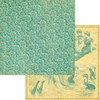
Great quality and color (01 September 2010)
This paper is high quality, and the blue green swirls are very abstract, and can be used for lay outs and cards that have nothing to do with the beach.
For me the The antiqued yellow side was not useful because I will be making cards out of the paper. But if you would like to do a beach layout, and find the bathing beauties of the 1920's cute and kitchy, this is a good paper for you.
I love the blue green swirls backed by the antiqued yellow, almost cream color. I will make several attractive cards using this because of it's versitility,
-
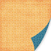
Nice design (03 August 2010)
The blue side of this paper is very nice..small intricate design in dark navy blue. I really love the blue side and will use it to make greating cards. It's really a nice color. The orange side is a rustic kind of orange with a distressed look.
-
Nice patterned paper (27 July 2010)
This is a high quality heavywight paper. I will use it for cardmaking, so it's a really nice pattern for me. It might be too busy for an entire scrap page, but I love it. When you see it in person, it's exactly as pictured, color and all.
-
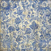
Beautiful paper (27 July 2010)
This paper is really beautiful when you see it for real. It reminds me of old china and kitchen linens that I saw in my grandma's house when I was little. It's regular paper weight and the blues in it remind me of delft blue that is used in painting delft china. It's almost a blueprint blue, with various complimentary shades of blue. the backround is a distressed off white. It looks very much like it is pictured here.
-
Nice abstract looking paper (27 July 2010)
This paper is heavyweight, and a really nice design. It's like a stylized version of holly boughs...But it can look almost abstract depending on how much of it you use, and how you crop it. I used it on Christmas cards, and it's really nice. The holly berries are a dark red, and the background has hints of almost mint green, and then a more traditional green as well.
-
Cute Bows (21 September 2018)
These are paper bows. They are on a distressed whitish background with black printing. Most of the prints are subtle and go with a lot of different papers. They seem to stick well. I put one on a Christmas card I made and it looks nice. They are small and handy when you need just one more embellishment on your card or page.
-
Both Sides are nice (23 August 2014)
I only bought one piece of this paper and I regret not getting more. I bought it for the ephemera side, but the dark blue with white polka dot side is really nice too. It's a nice heavy weight as well, and the ephemera looks really antique with scotch tape marks on the edges. the polka dot side is a nice dark blue that goes with a lot of papers I already have. I am going to get another couple of sheets before it's all gone.
-
Rustic beauty (02 August 2014)
I really like these different trims. They are really going to look nice on my masculine cards. They are quite sturdy and substantial.
-
Cool color for Christmas (16 November 2012)
I thought this was so different when I saw it. I purchased several different papers from this collection, and made some cool Christmas cards with it. It's nice quality heavy weight paper.
-
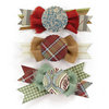
Cute and different (06 September 2011)
These embellishments are very cute. They are much bigger than they look from the picture. I would say each piece is about 2.5 inches by 1.5 inch, maybe a bit bigger. Basic Grey makes so many cool coordinating embellishments for when you just need one more piece to make your finished project.
-
Rich looking paper (06 September 2011)
This paper looks even nicer in person...kind of like vintage wall paper, but the colors are richer and deeper. I have a few pieces from this collection and I am very pleased with them. Basic Grey is a really great company for coordinating papers and items...so you can't go wrong with this.
-
So pretty for contrasting paper (22 May 2011)
I bought this because I saw it on a card, and was not sure about it. The design is a two way, not 4 way design. you can only use it vertically, if you flip it, the design is sideways as well. But when I got it home, it's so pretty, and even though it has the red in high contrast to the mint green, i'ts really subtle and pretty. I will use both sides of this paper on my cards.
-
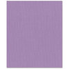
lighter lavendar shimmer (22 May 2011)
The color is just as pictured. It's got that nice canvas texture, a nice shimmer. It dresses up any page or a card you may be making. I don't feel it's heavy weight enough to stand as it's own as a card, but some people may use it for that purpose.
-
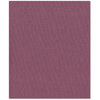
Nice plum shimmer (22 May 2011)
This is canvas bling, so you know you will get that nice shimmer with the canvas texture. It is more of a plum than a lavendar or purple. For me, it's exactly as pictured on my PC. I will get good use out of it because I have some card stock the exact color.
-
Very pretty and bright! (22 May 2011)
The colors on my PC are a little brighter than the paper was when I received it, but just as pretty. What looks like a light minty aqua is a darker aqua. Really pretty paper and good quality...heavyweight paper, I would say more than your normal 60# paper. I will use it for cards and probably end up buying it again.
-
Much pretier in person (12 March 2011)
The glitter accents on this paper are in the small design in the center of the paper. It's embedded glitter so it does not flake off. The paper is very pretty in person, and coordinates well with lots of olive toned papers I already have. I made a very pretty card out of it, if I do say so myself.
-
Very pretty (12 March 2011)
This paper is really pretty. The blue color in person is a bit darker than it is on my P.C., but it still looks very rich and almost royal with the gold colors. I have not used it yet, but I know I will make some interesting cards with it, and the coordinating print on the back.
-
Love Houndtooth (12 March 2011)
This paper is great. I love houndstooth, and this has just a tad of a distressed look, very nice. It also matches really nice with the dark blue papers in the Pink Paislee 365 degrees collection. I use them together on cards often. My only complaint is the back side of this paper is black...and it is such a waste not to have something coordinating on the back.
-
Nice patterns (12 March 2011)
This paper is really pretty. I love the color, and the coordinating pattern on the back. It actually matches with another Graphic 45 paper I have from a different collection. It has swirls on one side and bathing beauties on the back. So I am pleased I have three useable designs to coordinate on my cards.
-
So Pretty (12 March 2011)
The pictures of this paper do not do it justcie. It is so pretty with embedded gliter in the green parts. I will use it in making cards, and have so many other papers that will coordinate with it.
-
Nice Christmas colors (19 December 2010)
This paper is really nice. It looks more neutral than in the pictures. It will make some nice cards or a festive holiday lay out. One thiing that I didn't notice before buying is down the right side it's a darker shade and there is lettering.
-
Beautiful paper (19 December 2010)
This looks a lot nicer in person, than it does in pictures. It's a really subtle print, but a nice gold glittery color. I think it would look great on Christmas projects, but could be used for weddings and anniversary cards and layouts too.
-
Great rub ons (19 December 2010)
I used the zig zag stitch on two pieces of paper where they wre joined, so it would look like real stitching, and it does! The only issue I have it maybe the black is not right for all projects. They make it in white, but I feel that would be too bright for my projects. I think if they made it in tan it would be more useful all around.
-
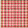
Nice pattern (31 October 2010)
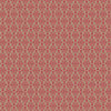
This houndstooth check is a great pattern to accent my Christmas cards. The red is more of a maroon/red, but it will go with a lot of Christmas papers. It's hard to tell the color from the picture, so I wanted to note it is not a traditional red. It's a nice thick quality paper.
-
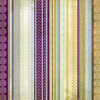
Pretty mix (26 October 2010)
The colors in this paper are all very different, and you would not think that they go together, but they look great. I will use it in strips, for the post part, as an accent to my homemade cards. It has given me a lot more ideas of color combinations I can use. The colors are kind of blurred together and muted, so it would look great on a scrapbook page, as well.
-
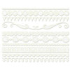
Pretty border edges (08 October 2010)
This punch makes a really nice delicate looking border for my projects. It is easy to line up the design at either end of the punch with the grid that is printed there. I tried it on cardstock and parchment paper. It works best on a thinner cardstock, maybe an 80 weight or lighter. It worked beautifully on the parchment as well. It did not work at all when I tried to use 105 weight paper. But that is to be expected. I have yet to find a punch, that works well on this heavy weight paper. But I keep trying. I highly recommend this as the nicest border punch I have ever seen, and the easiest I have ever used.
-
Clear sparkle (08 October 2010)
I chose this color of stickles because I wanted something kind of like white or something I could use on anything...this fits the bill. It's not white at all, really, but clear when it tries and it just leaves a really pretty sparkle.
-
Pretty Blue (26 September 2010)
This paper is very pretty. The blue is a nice shade...not too flashy, but vibrant enough to match with a lot of other papers. The background in kind of an ivory beige makes the paper look vintage. I will be using it on cards. It's part of a Christmas collection, but there aren't any holiday identifiers on the pattern or color. It really can be used for any occasion.
-
sublte ellegance (26 September 2010)
All these mats are very pretty. I am using them for card making, and so far they have really worked out well because they are easy to match. They ranged from very sublte to bigger prints in gold and silver. There are classic snowflake patterns, and more universal patterns that don't even look Christmas-y if you pair them with non Christmas papers.
-
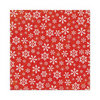
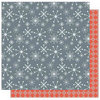
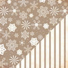
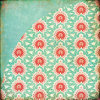
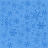
Bright blue snowflakes (12 September 2010)
This is a nice quality card stock. The color is very pretty. It's a bright light blue, and of course the glazed flakes are a darker shade. I will be using it for holiday cards, but I can see where it would make a nice base for a page layout. It's not too busy even though it's covered with snowflakes.
-
Shiney Gold! (12 September 2010)
This paper is just what you would think from the name. It's a medium weight card stock, and very gold and shiney. You can almost use it as a mirror. I'm using it as accent on Christmas cards. It would look great in a wedding or anniversary page layout.
-
Pretty Ivory paper (12 September 2010)
This paper is a good quality, and matches well with other ivory cardstock and paper I have. It's a nice texture which kind of looks like canvas, but it's pearlescent, very pretty. It's not super shiney, so it would not take away from your page layout.
-
White Irridescent cardstock (12 September 2010)
This paper was just what I wanted to go with some white pearlescent cardstock I had. It makes a nice contrast with it's texture, but it's the same color as my white paper. It's hard to know what the colors of this bazzill paper are unless you get all these shades of white next to each other. This one is white, April Birthstone is silvery, String of Pearls is ivory, and Glass Slipper is an off white.
-
Pearlescent Silver (12 September 2010)
I am not sure what I expected when I ordered this paper, but when it came it was a light silvery color. The paper is very nice, but not the color I wanted. April's birthstone is a diamond, so I thought maybe a variation of white, but the paper is silver. It's good quality, and I will end up using it, just not for it's intended purpose. If you are looking for a silvery tone that's not too shiny for a layout, this would be perfect. It reminded me of pewter.
-
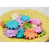
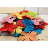
Assorted daisies (12 September 2010)
These paper flowers are very pretty. I paired them up with other flowers from the same company, and made even bigger blooms. They come in two sizes, so you can double them up with a corresponding color. All the colors match with each other. They are softer versions of primary and secondary colors. The green is lime-like, true lavender, sea foam blue, light yellow.
-
delicate and pretty (12 September 2010)
I have already used these flowers on several cards. They are very pretty if you double them up. The colors are very nice, a true red, lime-ish, soft yellow, brownish peachy orange, mauve-like pink, almost royal blue.
-
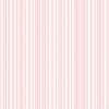
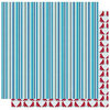
Pretty in Pink (10 September 2010)
This is a really pretty striped paper. The pinks are subtle and would work beautifully in a scrapbook layout. The colors are pretty, but subdued enough not to compete with your photos in the layout. Very girl looking for a stripe.
-
Pretty shades (10 September 2010)
This paper is pretty subtle in it's print. The shades are muted together, and I believe it would go well in a scrapbook layout. It is not so busy that it will compete with the photos in the layout. I will be using it in conjuction with other papers in the collection for my Christmas cards this year. The green side is great too, because it has slight graphic lines that make it easy to cut straight lines accurately.
-
Purple Haze (10 September 2010)
The purple side of this paper is such a great color! It's part of a winter collection of papers, but there is nothing on this paper that indicates Christmas or snow. It matches beautifully with the rest of the collection, but it can stand alone too. The dotted side is great because the dots are lined up in such a way that you can accurately cut a straight line by them.
-
Pretty aqua (10 September 2010)
This is such a pretty bright striped paper. Not overpowering, but the colors are just lovely. If you are looking for stripes to blend with any aqua paper or even water background pictures, I think this would go extremely well.
-
Classy look (10 September 2010)
This paper is really nice. I will use it for cards, but I think the coloring of this print would work well in a scrap book layout and not take away from the pictures. It is a subtle emerald green color on a craft brown background. Very classy looking.
-
Great colors (10 September 2010)
The striped glitter side of this paper is beautiful. So vibrant, and pretty. And the glitter is the kind that is encased in a kind of glaze, so you don't end up with glitter all over your fingers and face! The cardinal side is nice too, but much more subtle in coloring.
-
Fun, glitter snow flake paper (01 September 2010)
I purchased this paper to add to my Christmas card designs. It is very pretty, with every third or 4th white snowflake covered in glitter. It's very whimsical, and not exactly what I needed for the projects I had planned. But, before the Christmas season starts, I am going to design a card around this paper! And, I will post it in the gallary here on the site.
As for scrapping with it, The white snowflakes kind of fade into the background, and would probably not take attention from your pictures. It's lovely paper.
-
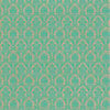
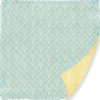
Subtle light blue high quality paper (01 September 2010)
I loved the pattern of this paper when I purchased it in green, so I decided to purchase it in blue. This paper is a really nice quality and thickness.
The blue is very subtle with a very slight green tone in the range of light blue I have used it to embellish cards and plan to use it at the principle part of the card.
The color is light enough, and the pattern quet enogh, that you could create a relatively busy lay out and this paper would not interfere with your photos.
* A funny note, this paper coordinates really nicely with the blue papers in Anna Griffin's Cecil collection.
-
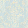
Subtle coloring, but beautiful (01 September 2010)
I love this paper!. I have used to to make two special birthday cards. The light blue is very light, but I did find some papers that were a suitable match it. It also comes with several matching sheets in the Cecile collection, if you don't like doing your own matching.
The flociking looks like real velvet, and it has a yellow cast to the cream color. But it you put it next to yellow, you can see clearly that it is cream. This is the classiest looking paper I have purchased in years. It's so nice, I could make wedding invitations out of it.
-
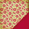
Great Pattern and colors (27 July 2010)
The paper looks a little bit different from the way it is pictured It has very detailed dark red flourishes on a craft paper background. It's heavyweight paper, really good quality. I make cards, and I have used this on several Christmas cards, and they look really classy.
|