FREE Standard Shipping on Orders $69+ with code:
FREESHIPPING

$29.99
$29.99
$230.00 $118.99
$75.00 $39.99
$80.00 $44.99


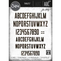
I use this one a lot. I love the bold font in this. I cannot say I use the cursive that much. You will not be disappointed if you buy this font. I have used this font in different sizes and it works well with all sizes.
Used in this project: An Original Princess page 2

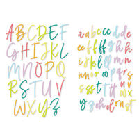
I have about cartridges and this is the one I use the most. Has great bold letters and beautiful cursive (if that's how you spell it). It is really a great all in one. You will not be disappointed in this.
Used in this project: My Table

I only have three cartridges but I think this one is my favorite. I've done several layouts and a couple cards using the different fonts. I would recommend this cartridge.

Great cart! Love my cricut! These letters are great....you can string them together to look like cursive words
Used in this project: My Sis

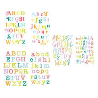
I use the cursive font and the "opposite" font a lot. I don't like the one with the circles and ovals around the letters because some of the letters have ovals, some with circles, and it looks stupid on a scrapbook page because it doesn't match. I guess it might work if you did some of the letters from each different style to get a ransom-like look. The cursive font works especially well if you have the cricut design studio because you can make the letters connect so that is is cut into one long word.

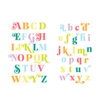
I got this cartridge about 6 or so months ago. I do use it a lot. It has a really great variety of different fonts. I like the upright cursive one the best though. Its the one I use most often. The other ones are nice too. The only thing that I don't like about this cartridge is when you use the regular cursive font it is so wide, I always have to cut it down which really isn't a big deal at all. Other than that its great!
Used in this project: Your Name is..

I really like this font cartridge. The true cursive on this font cartridge can take up lots of room because the letters have very long "tails"; however, there is an upright version that has shorter "tails" and that I probably use more often. In my opinion, this is a very elegant font and it is my go to frequently.

One of my first carts, and I use the upright and the opposite feature only. I don't like the long tails on the cursive, but the upright is GREAT.
Used in this project: LCFSMECALARB
You must be signed in to comment. Please click here to sign in.