shcg: i was going to suggest tying the two elements togther at the bottom but i see that you did that. maybe just the lighting. i would suggest a border to tye it all togther. otherwise it is a pretty good lo. good job.
this is a very nice gift. I have to say that I did think that it said our love. I would add a shadow to the letters to make them stand out. Great job!!!
Another great LO. Though the bright green you used on the far left and right edges does match the photo, I'm still a little uneasy about it... I think I would have gone a little more subtle... I also would maybe may your letters or create the same letter in a very light color and offset them a little to emphasize.
The title is definitely not easily seen. Is there any way you would be able to make a white "shadow" or mat for each letter of the title? if not, i'd definitely ink it. I would move the heart to the bottom left of the corner of the photo. and move the two rectangle boxes to the bottom right. i love this color combo, and it works well with this LO
This unexpected color combo works well w/ your photo! I agree on inking the title so you can see it better, in a dark brown. Also, inking the whole outside edge & the photo would bring it all together. I'd like to take K's idea of putting the heart to the side a step further by suggesting you move the journaling & that dark rectangle (don't know what it is) off in a cluster to the lower right, to offset the intersection of the brown pp on the lower left corner. As you've already given this (very sweet gift, BTW!), these are just some ideas to keep for the future. HTH!
I really do like this lo. The dark green background PP brings out the green in the photo beautifully. The only thing I would maybe do is ink the edges of the letters so that they stand out a little more. Very nice LO!
I love the photo placement and the title how it makes a half circle. I like the heart but would like to see it on the side of the photo instead of the middle.
I wanna be your sister-in-law and get great goodies like this! I would totally like to see the title either shadowed or matted to make the letters stand out a bit. I think that the darker brown would work nicely! Super job!
What a great gift! I like the colors together, but I think you can pull some of the blue from the title and use it on top of the green strips.Th title is a little hard to see-you can ink the letters or mat them.
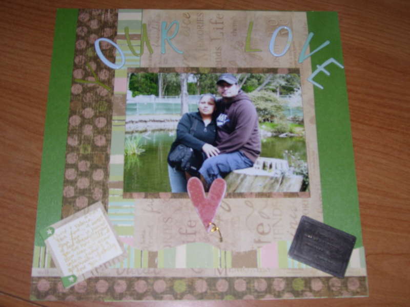
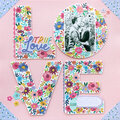
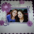
This LO is one I made for my sister in law with her husband, it looks like it says Our love but it says your love, the Y is camo by the paper. I used all her favorite colors and used the backround for my paper selection. I had a hard time finding the right lighting and It still did not come out the way I wanted it. Overall I am pretty happy with this LO. What do you think?
Does this project or one of it's images contain pornography, profanity, or other illegal or offensive material? If so, please report it and our moderators will come by and clean it up in a flash.
July 13, 2008
June 22, 2007
June 21, 2007
June 20, 2007
June 20, 2007
June 20, 2007
June 20, 2007
June 19, 2007
June 19, 2007
May 21, 2007
May 09, 2007
May 03, 2007
April 28, 2007
April 26, 2007
April 20, 2007
April 20, 2007
April 17, 2007
April 15, 2007
April 14, 2007
April 12, 2007
April 12, 2007
April 12, 2007