SHCG: I admit, I laughed when I first looked at this (totally in a good way though)! The contrast between the manly picture and the purple flowers just tickled me for some reason. :) I think this is a great calendar page... the flowers are very spring-y and the ribbon stickers add a festive touch. Great job!
SHCG: Non-masculine colors for a masculine page never really bothered me. I think it's best to complement the photo colors which you did with the orange. You have a lot of good suggestions. I'm with bringing the flowers closer together and closer to the photo. The only thing I have to add is to play up the sparkly stickers by scattering some foil mini squares above left and below left of the photo onto the bg paper.
SHCG: I love the angeled picture. I would suggest moving the picture down at either corner of the page, to give it a more negative space feel and I would also suggest clustering the flowers at the bottom corner of the photo. I do love the colors and flowers very much, great job :)
SHCG - It is a unique palette for a masculine page but as it's for April in a calendar, it works well. I really like the fresh pp, colors & embellies, as well as the lighthearted angled placement. I think the photo could use some additional emphasis; as Janet suggested, a thin purple matte (or any solid bright color that coordinates w/ your fantastic pp & flowers - orange, fuchsia, copper, blue) would do that nicely. Overall, a playful & spirited page, TFS! And a very thoughtful project for your BIL.
SHCG: I like the embellishments but still feel the page is missing something. I'd like to see the photo matted with a thin purple border and I'd also like to see a border of some sort around the edges of the page.
shcg: an interesting palette of colors for a masculine lo. love the textures in the layered flowers. some suggestions to give you page a bit more "oomph" -- a doodled border around the entire 12x12 could add a lot, as could the same around your pp/photo (i'd suggest a random border around the large page and maybe stitching around the pp). the stickers seem a bit out of place -- i could almost see the two being used as a photo corner of sorts.
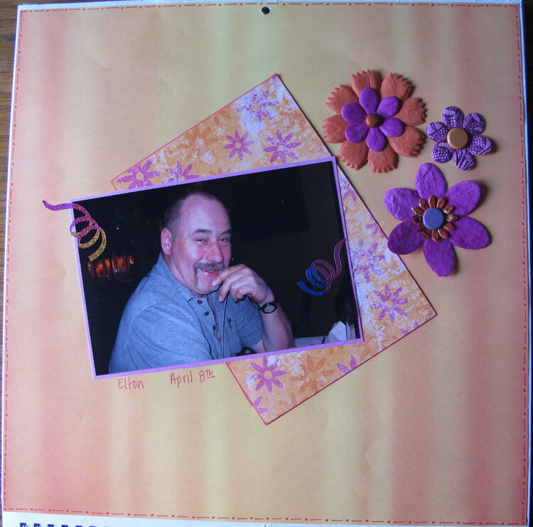
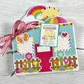
This is a revised LO, thanks to some suggestions from the SHCG. Still might need some work. For my brother-in-laws calendar, this is another brother-in-law's picture, his birthday is in April. Kind of foo-fooey for a guy, but it is for April.
Does this project or one of it's images contain pornography, profanity, or other illegal or offensive material? If so, please report it and our moderators will come by and clean it up in a flash.
September 30, 2009
September 28, 2009
September 12, 2009
September 10, 2009
September 09, 2009
September 08, 2009
September 08, 2009
September 07, 2009
September 07, 2009