FREE Standard Shipping on Orders $69+ with code:
FREESHIPPING

Cheers
Give a Cheer

 Give a Cheer
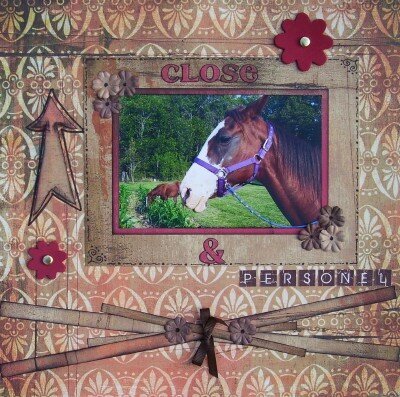
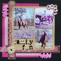
I love this sweet pic of our new horses!! The arrow is 3-D with using pop dots to lift it. Thanks so much for looking!
~*Dawn*~
Products used:
BG pp's
MM Leather Flowers-Red
misc. brads
EK Success Alpha Stickers
stampcraft ink--black
primas
K&Co ribbon
BG letter stickers
No products have been added to this project.
Thanks for spreading positivity!


September 18, 2006
September 08, 2006
September 07, 2006
September 07, 2006
September 06, 2006
September 06, 2006
September 05, 2006
September 05, 2006
September 05, 2006
September 04, 2006
September 04, 2006
September 04, 2006
September 03, 2006
September 02, 2006
September 02, 2006
September 02, 2006
September 02, 2006
September 01, 2006
September 01, 2006
September 01, 2006
September 01, 2006
September 01, 2006
September 01, 2006
September 01, 2006
September 01, 2006
September 01, 2006
September 01, 2006
September 01, 2006
September 01, 2006
September 01, 2006
September 01, 2006
September 01, 2006
September 01, 2006
September 01, 2006
September 01, 2006
September 01, 2006
September 01, 2006
September 01, 2006
September 01, 2006
September 01, 2006
September 01, 2006