


Happy National Scrapbook Day!
FREE Gift + Extra 12% OFF Orders With Code: CELEBRATE
FREE Gift + Extra 12% OFF Orders With Code: CELEBRATE

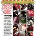
 Give a Cheer
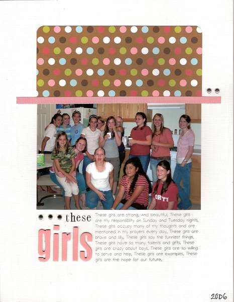
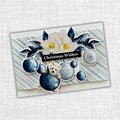
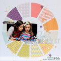
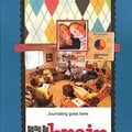
This lo took approximately 20 minutes to complete... my kind of lo. It tells the story of the girls I work with thru a youth group at church. Love them all!
Thanks for spreading positivity!


February 17, 2008
July 24, 2007
June 25, 2007
May 30, 2007
May 24, 2007
May 19, 2007
May 18, 2007
May 18, 2007
May 17, 2007
May 17, 2007
May 17, 2007
May 17, 2007
May 17, 2007
May 17, 2007
May 17, 2007
May 17, 2007
May 14, 2007
May 11, 2007
May 09, 2007
May 08, 2007
May 08, 2007
May 07, 2007
May 07, 2007
May 03, 2007
May 01, 2007
April 30, 2007
April 30, 2007