FREE Standard Shipping on Orders $69+ with code:
FREESHIPPING

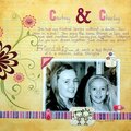
Cheers
Give a Cheer
 Give a Cheer
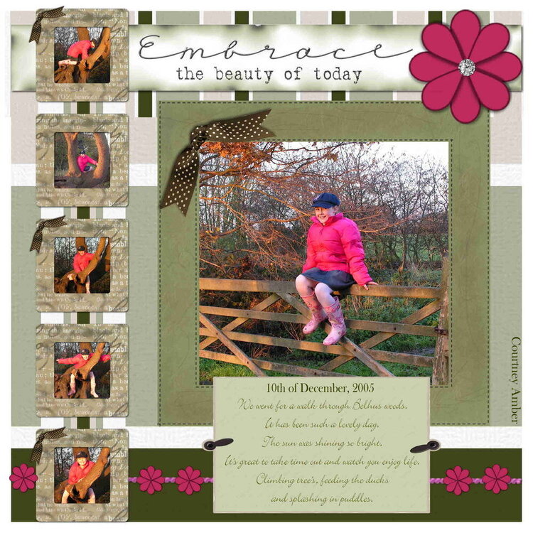
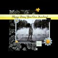
Lo of my dd. Pic's taken yesterday.
Lo created using scrapbook factory deluxe 3.0
I'm not sure about the knots os brown ribbon on this!
Journaling reads:
We went for a walk through Belhus woods.
It has been such a lovely day.
The sun was shining so bright.
It's great to take time out and watch you enjoy life.
Climbing tree's, feeding the ducks
and splashing in puddles.
TIA - Andrea
No products have been added to this project.


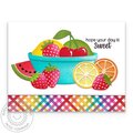
Thanks for spreading positivity!


December 14, 2005
December 13, 2005
December 12, 2005
December 12, 2005
December 12, 2005
December 12, 2005
December 12, 2005
December 12, 2005
December 12, 2005
December 12, 2005
December 11, 2005
December 11, 2005
December 11, 2005
December 11, 2005
December 11, 2005
December 11, 2005
December 11, 2005