FREE Standard Shipping on Orders $69+ with code:
FREESHIPPING

Cheers
Give a Cheer

 Give a Cheer
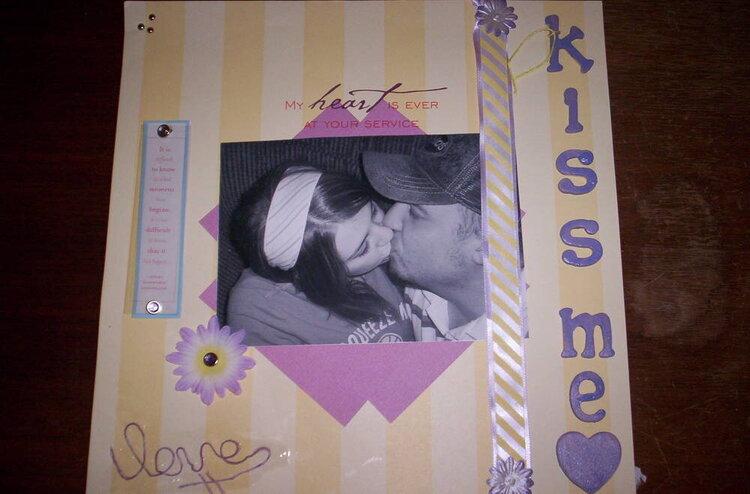
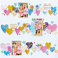
I worked really hard on this one so be nice! Do you think there are too many different purples? I liked it, but I'm just wondering.
No products have been added to this project.


Thanks for spreading positivity!


May 22, 2006
May 19, 2006
May 19, 2006
May 19, 2006
May 19, 2006
May 19, 2006