
Cheers
Give a Cheer

 Give a Cheer
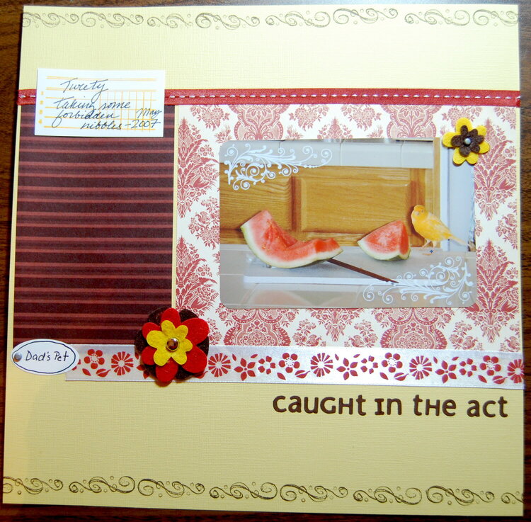
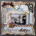
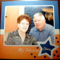
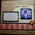
I used some of the paper from Ricky & Nitza layout to complete this one. It is scraplifted from an Ali Edwards book, can't remember which one.
No products have been added to this project.
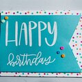
Thanks for spreading positivity!


April 06, 2008
March 03, 2008
February 25, 2008
February 23, 2008
February 22, 2008
February 19, 2008
February 17, 2008
February 16, 2008
February 16, 2008
February 16, 2008
February 15, 2008