SHCG: What an adorable picture of you two! I love the title and the whole concept behind the theme. I would like the flowers and buttons combined and grouped together. So that they are less of a border and more of anchors at the corners of the layout. Does that make sense? This is absolutely lovely!
SHCG: You two make a great looking couple! I love the colors of the pp, the buttons and embelishments, especially the arrow. I think some doodling (just small straight lines or dashes & dots) around the photo would also look nice. Great job.
SHCG: Love the bling cardstock, so sparkly. But what a beautiful photo, definatley depicts what the title says. The use of the arrows is done well and i like the scattered effect given to the flowers and then a more orderly effect for the buttons opposite. Looks very interesting.
SHCG: I have those letter stamps and never really knew how to use them. I love how you stamped on another pice of paper and cut out around it. I try not to read other suggestions until I am done critiqueing and in this case my critique came out exactly the same way as some suggestions below. All of your buttons and flowers are beautiful on this page but very scattered. I would take all of those buttons and cluster them around the picture in no particular random order. I would also add some flower centers with some butttons or brads and move those closer to the picture. This will leave some blank space, but I feel that is perfectly accetable. You could ink the edges of the background paper to tie the whole thing together. Super cute picture and I can completely understand why you love it so much!!
SHCG: This is a great moment captured between the two of you, and your title is definitely fitting. I like your handwritten title strips and the word stickers, as well as the colors. While the arrows do draw attention to the photo, my eyes keep wandering back to the button and flower sneezes, especially since they're grouped separately. Consider clustering them, and instead of separating them, make the buttons centers for the flowers. As is, they don't seem to have a connection to the photo. Also, adding some elements of layering underneath the photo with some pp could bring more dimension and depth to the page.
SHCG: Neat page! I'd add the date of this event somewhere on the page and would also change the embellishments around a bit as some of the other gals suggested.
SHCG: aw, what a great picture!! love the title, and the style of it. I think I would take all of those embellies in the top right and make a photo corner out of them in the top right of the photo. Such a lovely page
SHCG - Aww, I can definitely see the love here, Vanessa! The photo, colors, words & embellies are outstanding, but I think it would make more sense if you gathered those cute embellies around the photo more, or added more of the embellies clustered around the photo, so that focus flows more to the photo (you could leave the words where they are). Having the embellies placed in the outer corners sort of draws attention outwards to the paper edges, rather than towards this cutecutecute photo. Great stuff, though... lovin what you got so far on this page!
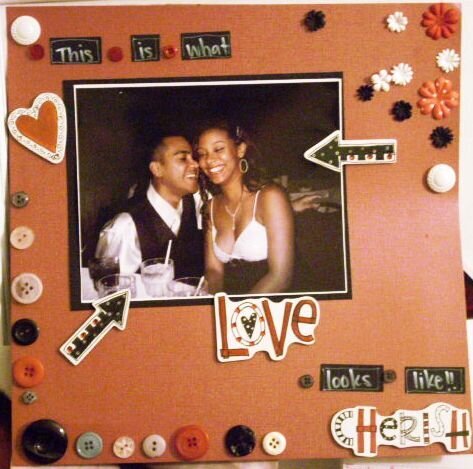
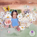
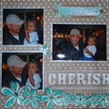
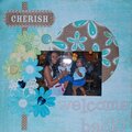
This has to be one of my favorite layouts! This picture was taken at Will's command Christmas party. We wernt ready for the picture when it was taken! but it is my favorite because just looking at it, you can see the love!
Does this project or one of it's images contain pornography, profanity, or other illegal or offensive material? If so, please report it and our moderators will come by and clean it up in a flash.
August 22, 2008
August 19, 2008
August 18, 2008
August 16, 2008
July 30, 2008
April 06, 2008
March 12, 2008
March 01, 2008
February 29, 2008
February 29, 2008
February 29, 2008
February 26, 2008
February 25, 2008
February 24, 2008
February 24, 2008
February 24, 2008
February 24, 2008
February 23, 2008